Cutting-edge solutions to unlock the power of your data.
Companies have more data than ever and must find ways to cope with this larger and complex information. A McKinsey research shows that the gap between leaders and laggards in adopting data and analytics is growing, and companies with the greatest revenue growth receive a significant boost from their efficient use of data.
Having the right underlying technology is key to unlocking this opportunity. Does your company have a custom data-analytics dashboard to help you harness the power of your data?
In this article, we will dive into some points on how a custom data-analytics dashboard can help your company unlock the narrative and strategic power of your data and you will see real-life examples of how executives across all industries implemented them with significant results.
What is a data-analytics custom dashboard?
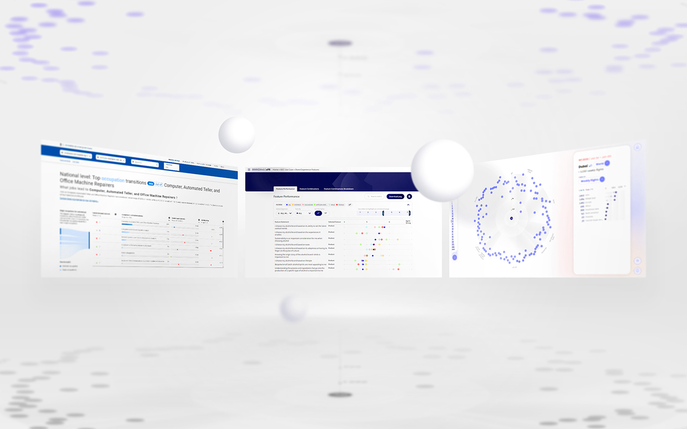
A data-analytics dashboard, or business intelligence dashboard, is generally understood as an interactive platform that offers immediate navigable access to data and information to monitor, analyze, and easily extract business or marketing insights.
Thanks to data visualization techniques, dashboards become a great tool to overcome the inherent barriers in the complexity of data and guide companies to better-informed and forward-looking decision-making processes.
Several services are offering standard dashboards, however, the benefits of a tailored dashboard (discussed further down) are not to be overlooked, especially for large companies and institutions which naturally have a complex architecture of data and information.
Data analytics dashboards can be integrated into existing systems like CRM platforms, marketing automation tools, social networks, and many others. Hence, it is possible to collect data and information from multiple sources in a single panel and in an automated way. A well-designed dashboard is intuitive and visually engaging, allowing any person, even those without any technical background, to understand and use complex information.
In practice, dashboards have multiple purposes and endless uses: from reading insights and taking action on the performance of a product, to delivering a message to stakeholders or customers, for example, about the steps taken to a more sustainable future.
Dashboards can be divided between:
- Analytical dashboards are used to evaluate vast volumes of data to help find patterns, discover insights, and forecast possible outcomes.
- Operational dashboards are often used to monitor regularly changing business operations. This form of data dashboard is intended to be used several times each day to closely monitor progress toward a certain aim or objective.
What are the benefits of custom dashboards?
“The dashboard allowed us to organize all of Credem’s information assets, making them easily accessible and explorable for all of our employees. Now we can access information much more quickly and easily, which has improved the group’s decision-making process.”
Stefano Zoni – Chief Data & Analytics Officer at Credem Banca
Regardless of the type of dashboard used or its specific objective, there are three key advantages that your company can benefit from:
Personalization
Each business has its own business models, its own goals and as such, its own KPIs: the adaptability of custom dashboards allows you to choose exactly what information should be tracked and its level of granularity.
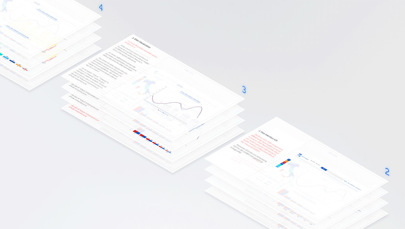
As custom dashboards are complex systems, the whole creation process is followed by a dedicated Account Manager who knows your goals and needs. In case the dashboard might need some tweaks or new objectives arise, the account manager will be available for assistance, even after completion.
Access to your data
Need to track data from multiple sources and on multiple devices?
While the front-end design is entirely ad-hoc and responsive, the back-end can be directly connected to your databases and/or APIs without the need of third-party softwares and fees, so you can enable autonomous, real-time data access.
At the same time, dashboards can be fully integrated within the current company’s systems, like websites or back office platforms. They can also be developed as standalone applications and follow your visual brand style guidelines, keeping consistency with your brand identity.
Efficient communication
Traditionally, business intelligence dashboards are intended as an analytical instrument, but companies can mix their versatility with the power of data storytelling to turn them into innovative and powerful means of communication to connect with different audiences like stakeholders, customers, or employees.
These versatile digital platforms can turn into the main touchpoint of integrated communication campaigns: they engage the audience thanks to interactive sections where users browse and assimilate information intuitively, emphasizing the message and highlighting the distinctive characteristics of the brand.
Six examples of custom dashboards
Below are six corporations that have implemented data-analysis dashboards across multiple industries, in various departments, and with different scopes, extending data usability beyond business analytics teams. These examples highlight how dashboards are a powerful tool to ensure quality, compatibility, and flexibility while following the company’s brand identity and organizational structure.
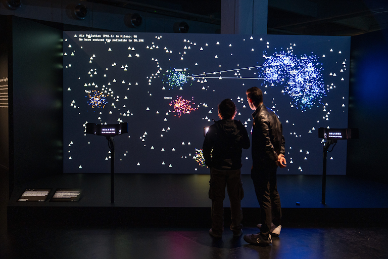
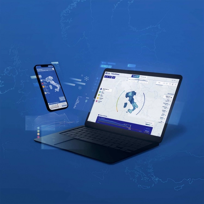
1. Terna: communicating sustainability
As the main European operator for electricity transmission, Terna has access to huge amounts of energy usage data. Through in-depth analysis is able to provide a detailed picture of Italy’s current status on decarbonization status, giving insights into how the country needs to adapt to meet its national objectives. But how can they communicate this rich and complex information to their audience in an engaging way?
The answer is Terna4Green, a dashboard to easily track the decarbonizing progress as it happens. As a result, Terna’s savings data converge on a digital platform that tracks the progression of saved carbon dioxide and compares the performance of various renewable sources. The result is a precise visual depiction of decarbonization connected to renewable power.
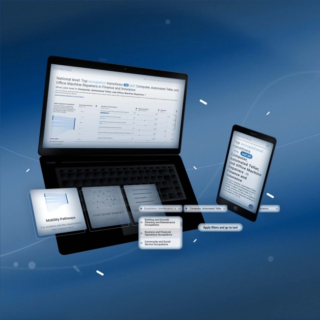
2. Brookings: a dashboard for companies, policymakers and workers
The Brookings Institution is an American research group whose goal is to lead to new ideas for solving problems facing society. To present and give access to thorough research on workforce development in major US cities, Brookings needed a tool to quickly update the database as well as efficiently present insights to inform and educate companies, policymakers, and workers on strategic and informed decisions to optimize recruitment processes. How to turn this data into actionable information that can be easily accessed by an audience with different levels of knowledge?
A custom dashboard hosted directly on the client’s website that allows researchers to easily and regularly update the data, giving human resources departments, workers, and policymakers access to reliable, tailored, and up-to-date information.
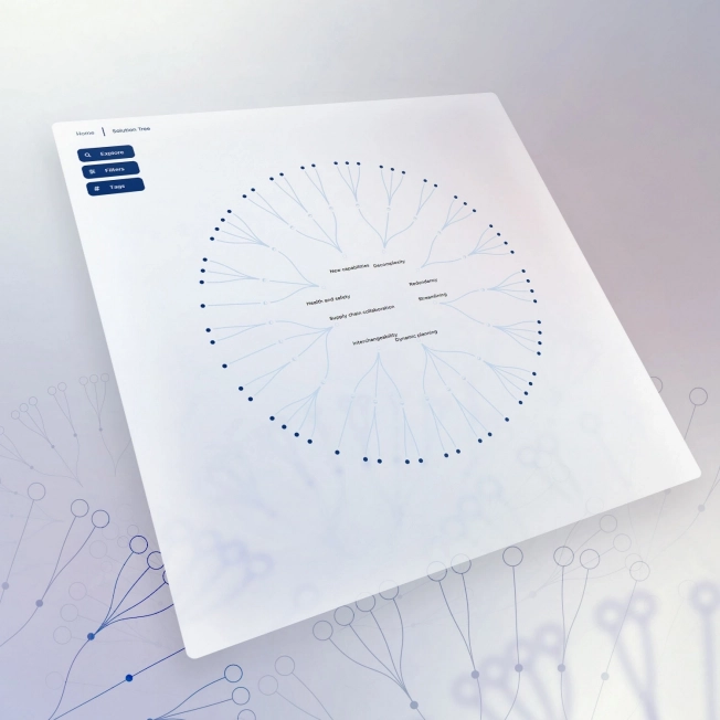
3. GS1 Italy: mapping logistic solutions
GS1 Italy, the only Italian body authorized to issue barcodes, wanted to create a wide knowledge base of solutions and approaches adopted by different enterprises to ensure business continuity during the Covid crisis and help companies prepare for the uncertainty of the future. How to turn this valuable information into a reference point for the FMCG industry?
After having analyzed different solutions with the client, we opted for an interactive map that can be easily accessed both on desktop and mobile and it catalogs the logistic solutions. It can be considered a practical and supportive guide to navigating an uncertain future based on the knowledge that collaboration, digitization, and transparency in the supply chain will remain key elements in the face of new challenges.
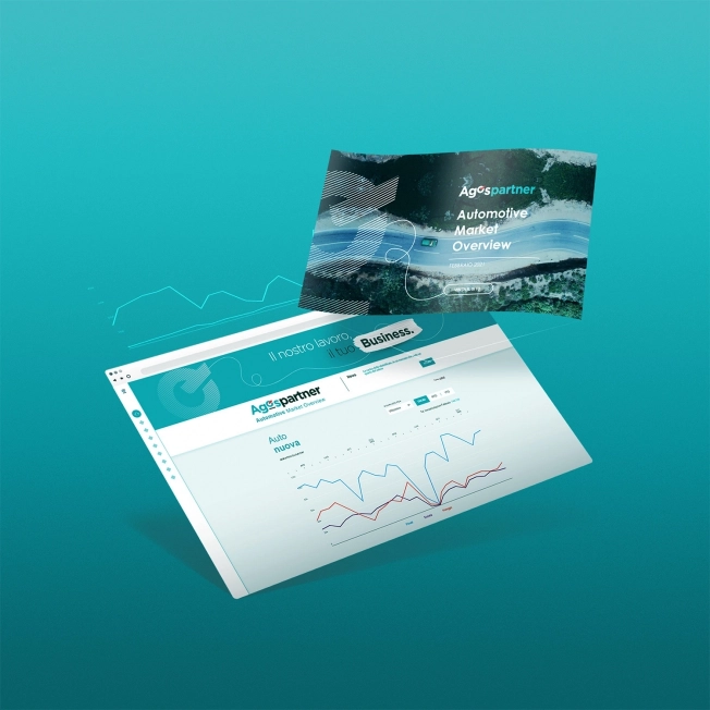
4. Agos Partner: optimize commercial strategy
To consolidate its position as a leader in the automotive B2B market, Agos Partner wanted to gather and communicate open data on plate registrations and offer its stakeholders a clear and complete vision of market trends. How to transform this data into an efficient marketing tool?
With an elegant look & feel, the Automotive Market Overview guides the user through the data-set on the automotive market and it is possible to filter by typology (car, motorbike, and green vehicles), geographic position, and purchasing methods (new or used). The interactive elements are designed to facilitate navigation and personalization, allowing users to have an overview of their chosen KPIs.
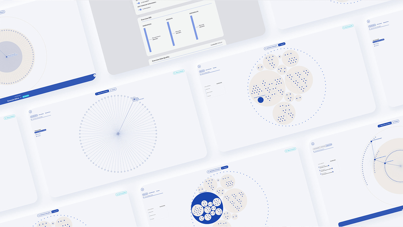
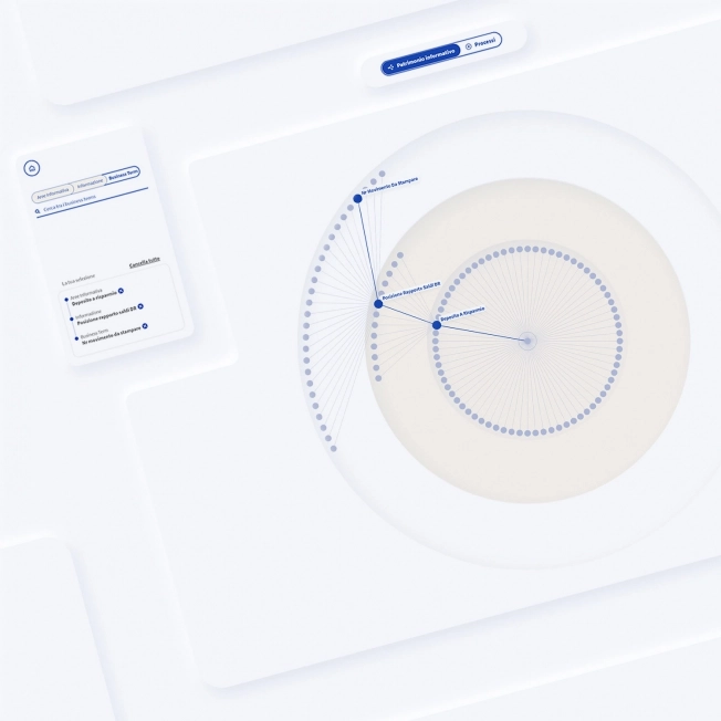
5. Credem: reorganizing the information assets of a banking group
Credem, the third most important Italian banking group, needed a tool to make its information assets easily accessible and explorable to all its employees. How can the information be organized in a simple and intuitive way so that all users can extract and effectively use its content?
The design of this interactive dashboard, developed in close collaboration with the client, responds with great accuracy to the company’s business requirements. Several user experience tools (personas, user flow, information architecture, …) were used to analyze and test its usability so that it has a highly user-centric design, making the analysis and use of data easily accessible for the end user, also thanks to a visualization that adapts to different navigation flows.
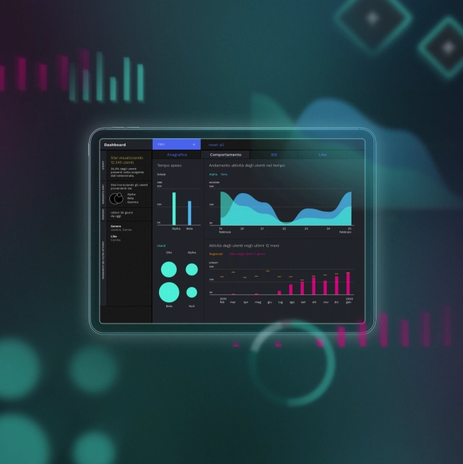
6. Mediaset: profile media consumers and optimize broadcast schedule
The largest commercial broadcaster in Italy, Mediaset, needed a way to track consumers’ socio-demographic characteristics and behavior to adapt its TV program offering accordingly and improve its ratings as a result. How can we extract real-time information on performance and improve our products’ performance?
A tailored dashboard that provided Mediaset with the power to optimize broadcasting based on the aggregated data of millions of active users on different data sources and touchpoints, allowing them to visualize real-time preferences, habits, and interests across the station’s programming.