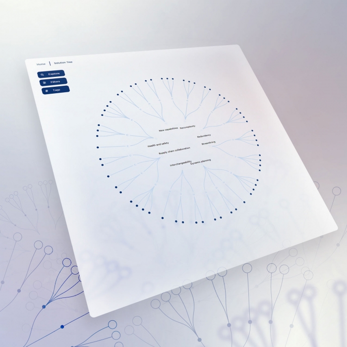
A dashboard to profile media consumers and optimize broadcast schedule
- Detailed user profiling
- Optimize operations
- Big data at a glance
«The Visual Agency's expertise has successfully satisfied our request to create an experimental product that visualizes the entire complexity of our big-data that derives from different data-sources and touchpoints. The Visual Agency created a functional, immersive and aesthetically sophisticated application for us.»
Explore the project
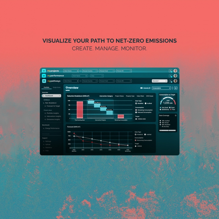
The dashboard’s interface design has been inspired by technological instruments and reinterpreted using a style that leans towards the digital world.
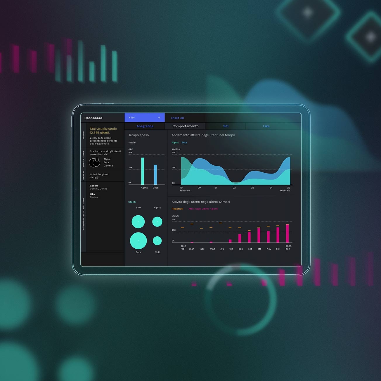
The dashboard design
The different shades and scales of black exalt the spaces between the different graphs and the color selection. The use of outline borders for the graphs and the sans serif font are equally important for the user experience and user friendliness of the dashboard’s design.
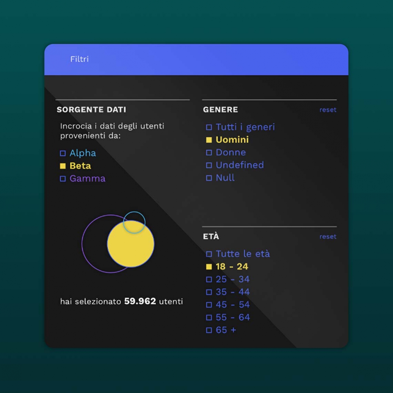
The accessibility
The black background has been chosen to create a more friendly environment for the eyes, which is especially important if the user needs to work with the dashboard for longer periods of time.
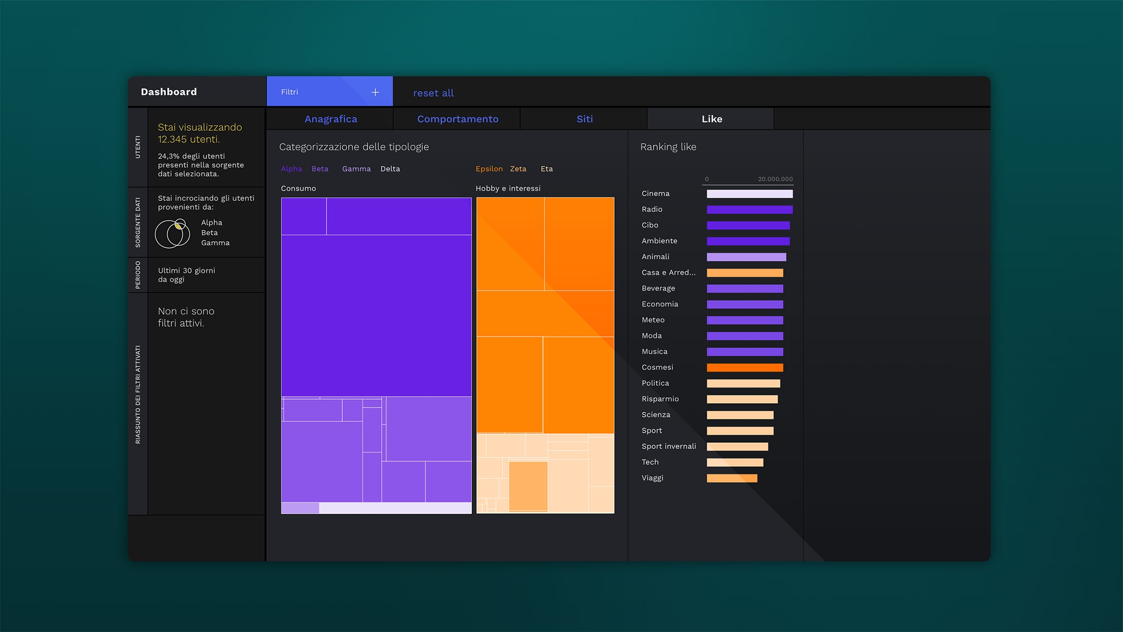
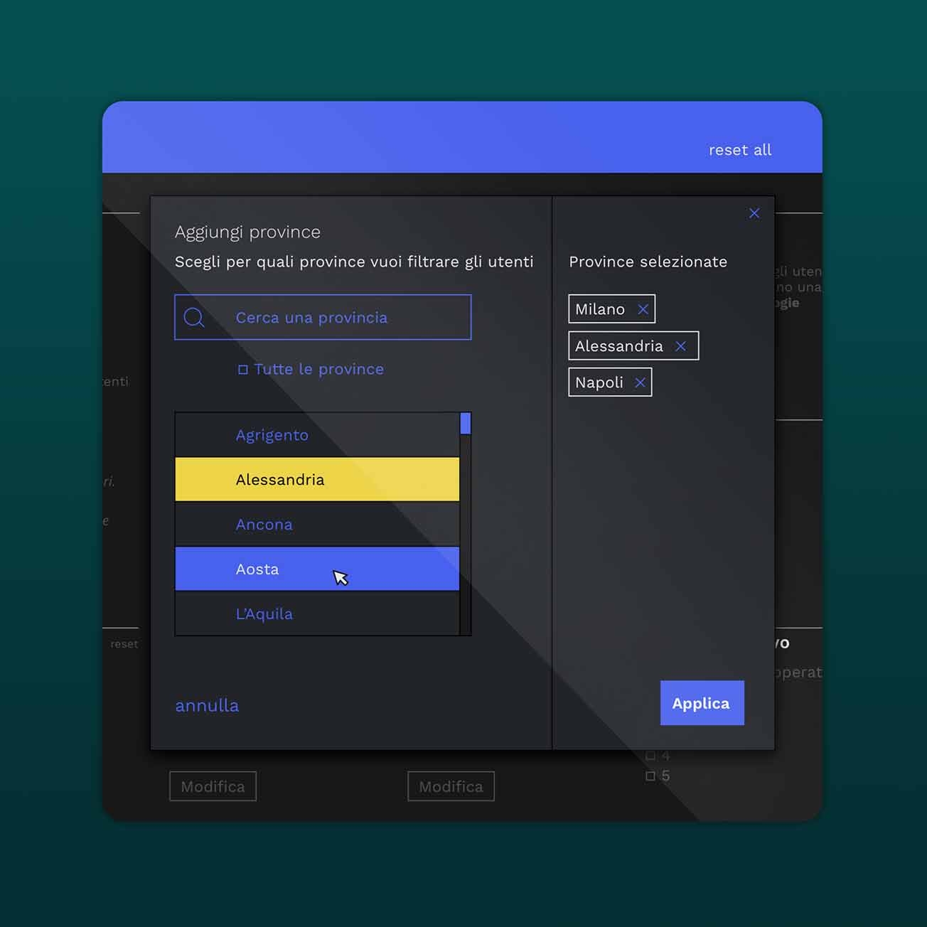
A user–friendly design
The rationale behind these specific design choices was to create an environment that facilitates the analysis and exploration of the data.
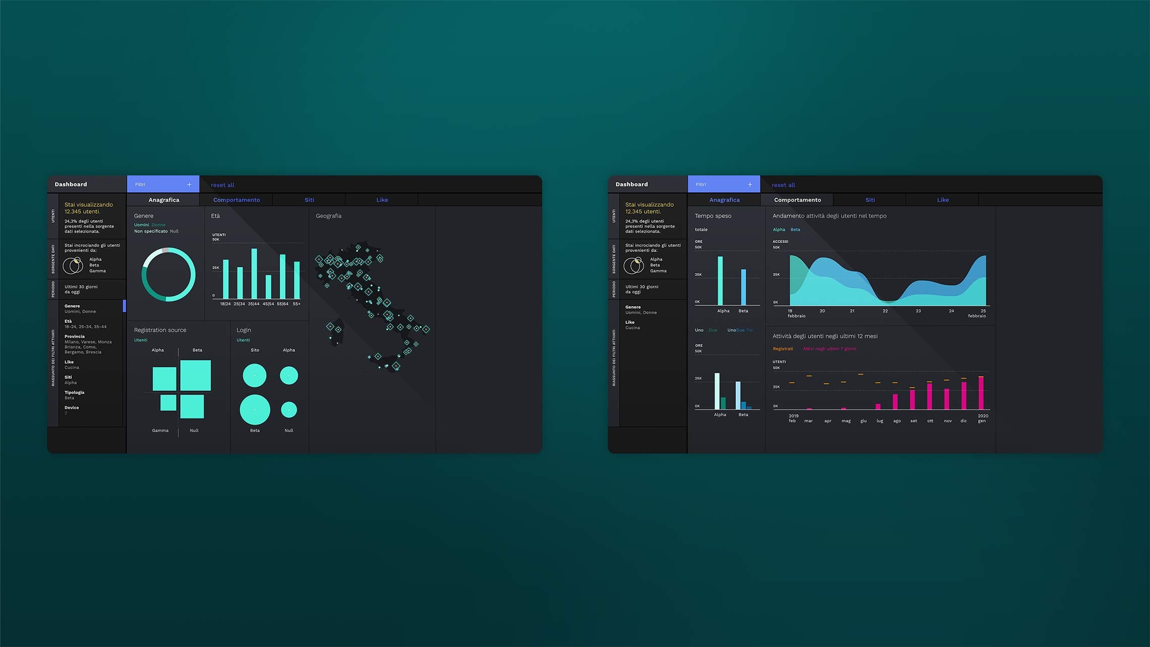
Visualizing the information
The landing page gives all the necessary background information about the three user types of the dashboard. All filters have been organized on a dedicated page with a special navigation bar to see all available filters at one glance. This allows for getting a general overview before further drilling down into the dataset using other functions.
