Creation of an information design library for communication
Marketing optimization - Strengthen content design to improve messaging
Explore the project
The Visual Agency was hired to advise ENI on how to redesign their main interactive infographics ahead of the launch of the new eni.com website on 6 February 2020.

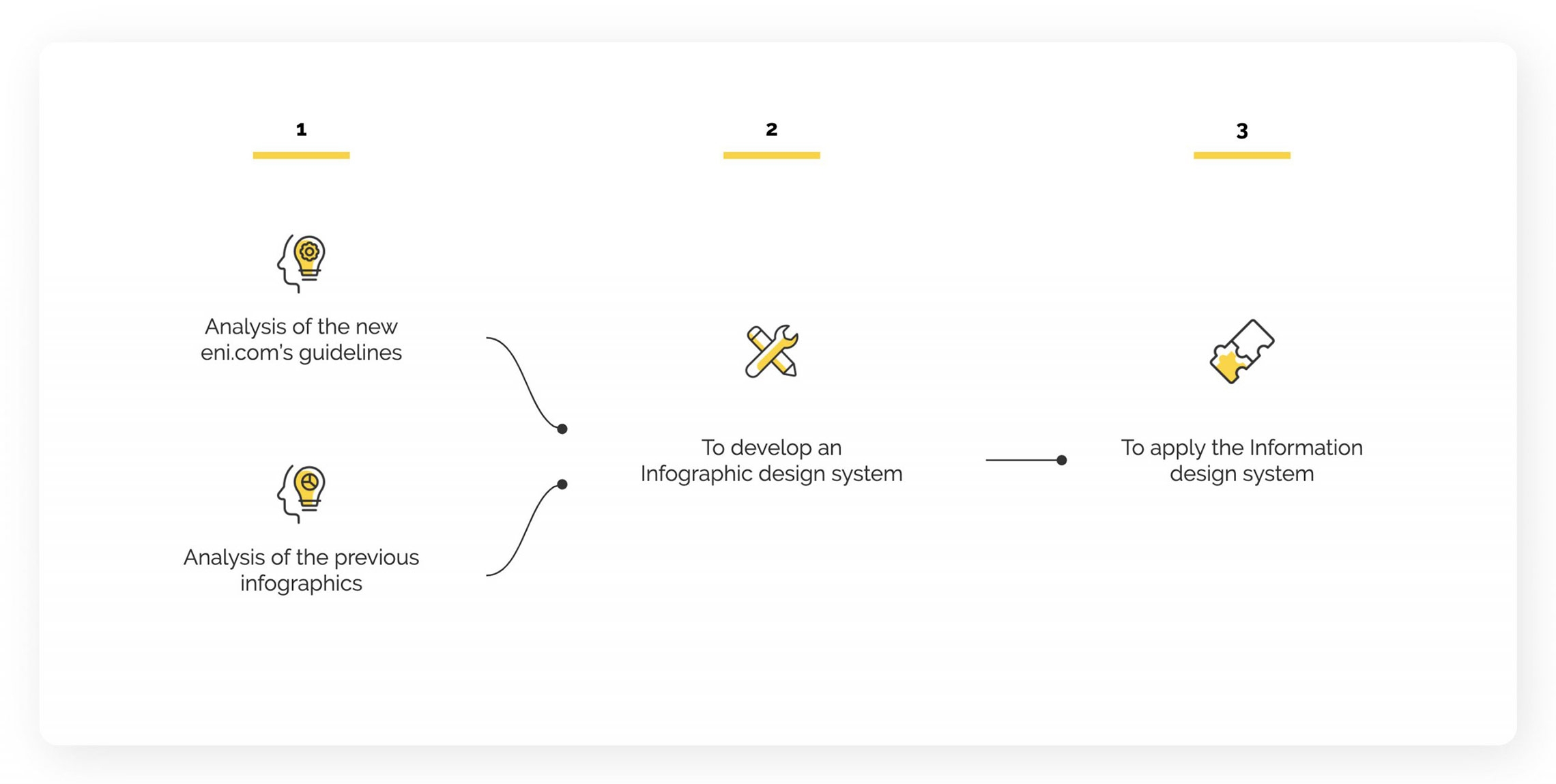
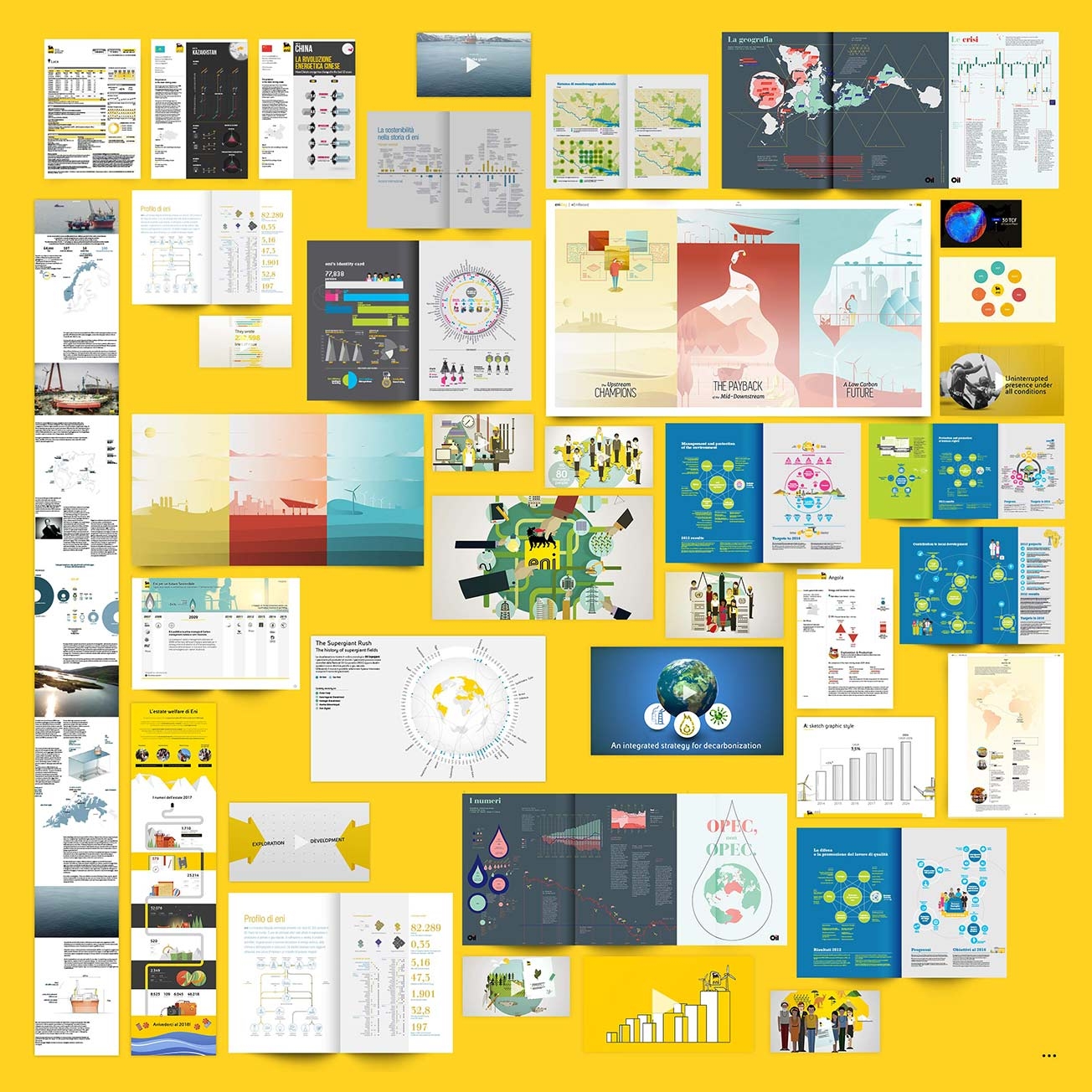
Consultancy phase 1 - Analyzing the status quo

The process
In order to standardize the different communication and style languages introduced over the years in various re-works and by different content owners, it was essential to entirely rethink the process behind the creation of interactive visualizations, from design to development.
Consultancy phase 2 - Developing an organic Information design system
Designing guidelines
The drafting of simple style guidelines for the design of infographics would not have been sufficient to support the design and development needed for broad-production.
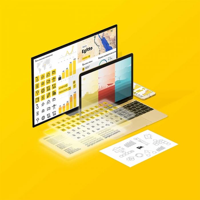
An entirely new style system was developed, creating and incorporating the brand guidelines provided by the client and combining these with an analysis of previous projects, focusing on the future content needs and outputs of the company.
Elements of atomic design
The graphic design consists of both structural and indexical elements:
1. Structural elements to spatially distribute data and form a grid on which to display information.
2. Numerical indications, which serve as a reference for the representation of the data.
Combining elements & navigation
The combination and interaction of the different atomic elements have allowed us to create a new and appealing modular system, keeping the client’s design identity.
A linear and intuitive navigation mode has been designed to facilitate the use of content.
The grid
Starting from the interface layout, we designed a modular grid on which to display the components of the infographic. The basic module (360×185 px) functions as a unit employed to build multiple layout variations. This provides a tool for organizing information and offering a perimeter of action for all data visualization values.
Consultancy phase 3 - To apply the information design system
The application
The system was then used as a starting point for the design of new infographic components. Different textual, dynamic and interactive elements are used to create complete and immersive visualizations that clearly represent data and make content easily accessible.

