How to visualize data with a specific software solution - Power BI
Customer Value - Increase customer understanding
Explore the project
Terna’s consultancy was split into three different phases to analyze, conceptualize and design the project in partnership with the client.
Our focus was on understanding the data information and data organization scenarios, followed by an assessment of different alternatives and finally prototype design. Read further to understand each phase.
Consultancy Phase 1 -
Analyzing the state of the art
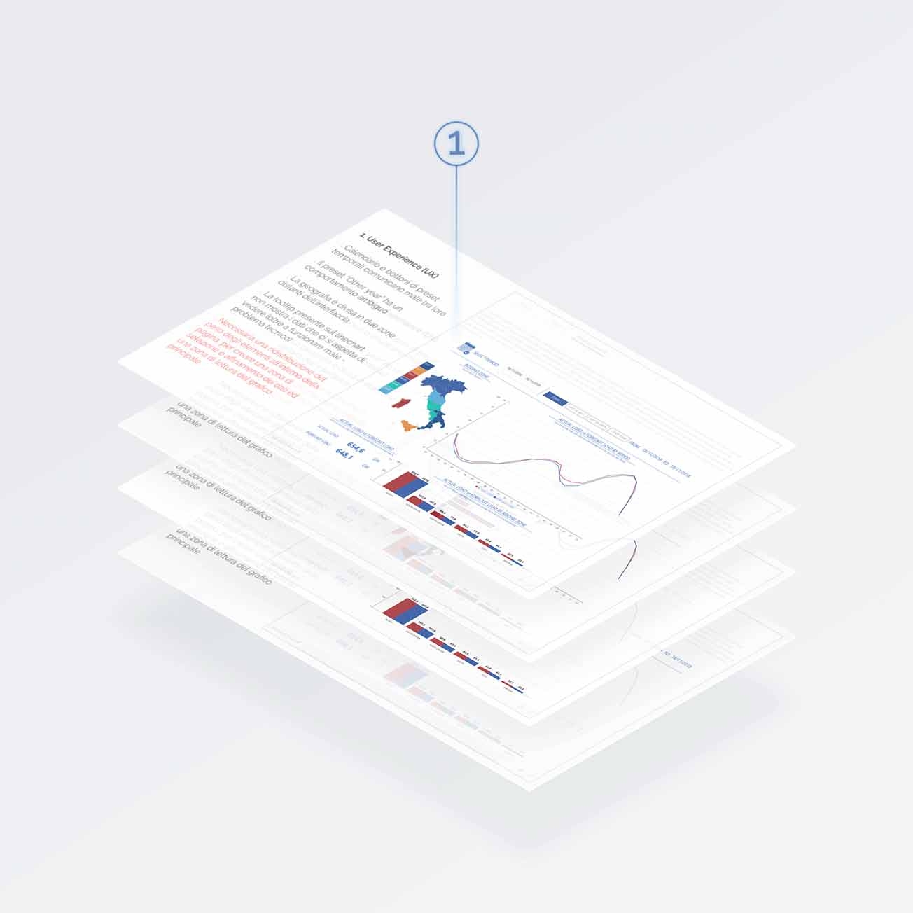
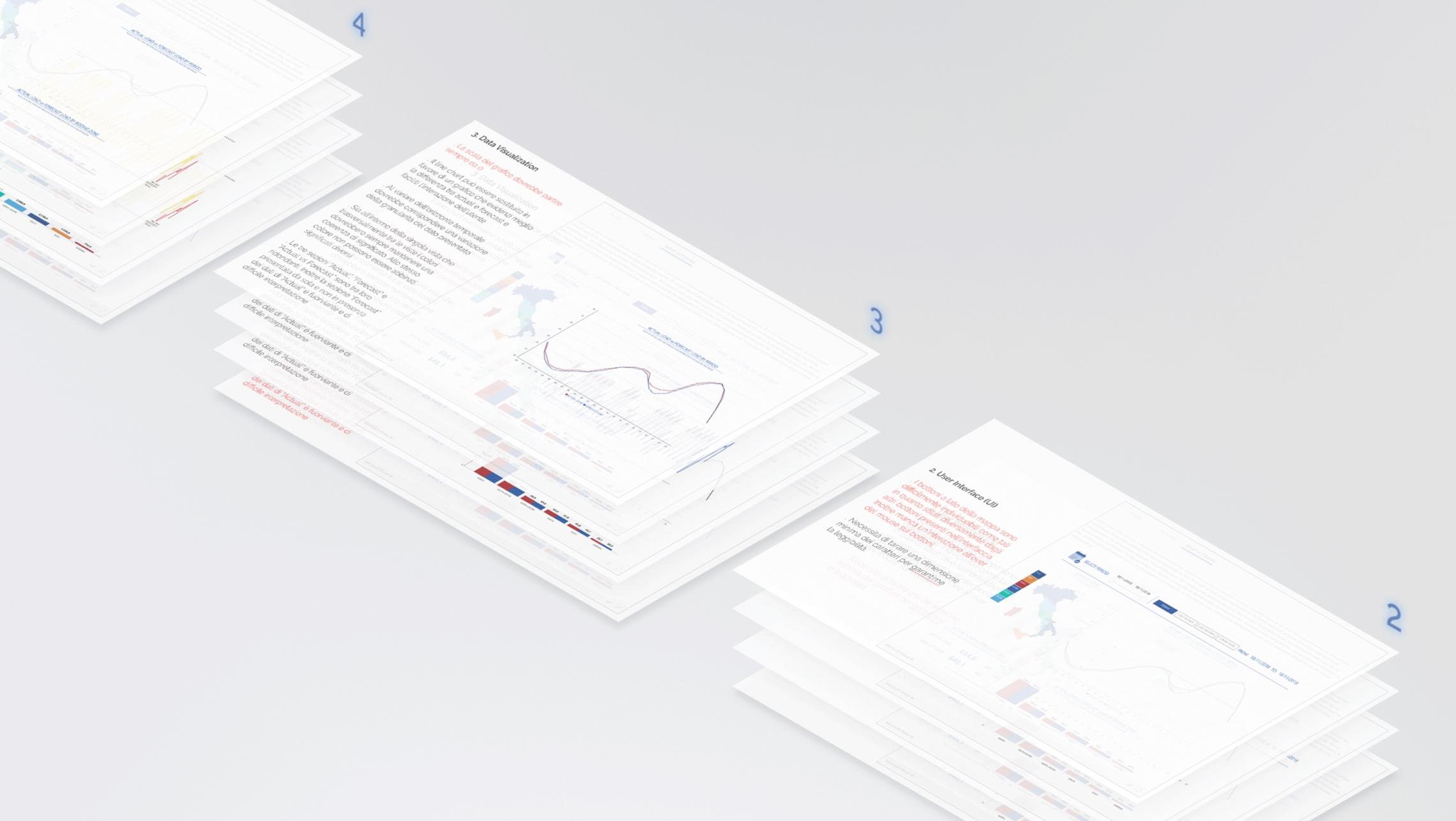
The project started off with an assessment of the client’s prototypes and included the reorganization and positioning of the information available, the improvement of the effectiveness of the visualizations used and their usability for the reader.
Our analysis was divided into four macro-areas:
- User Experience (UX)
- User Interface (UI)
- Data Visualization
- Copywriting
Consultancy Phase 2 -
Exploring possibilities
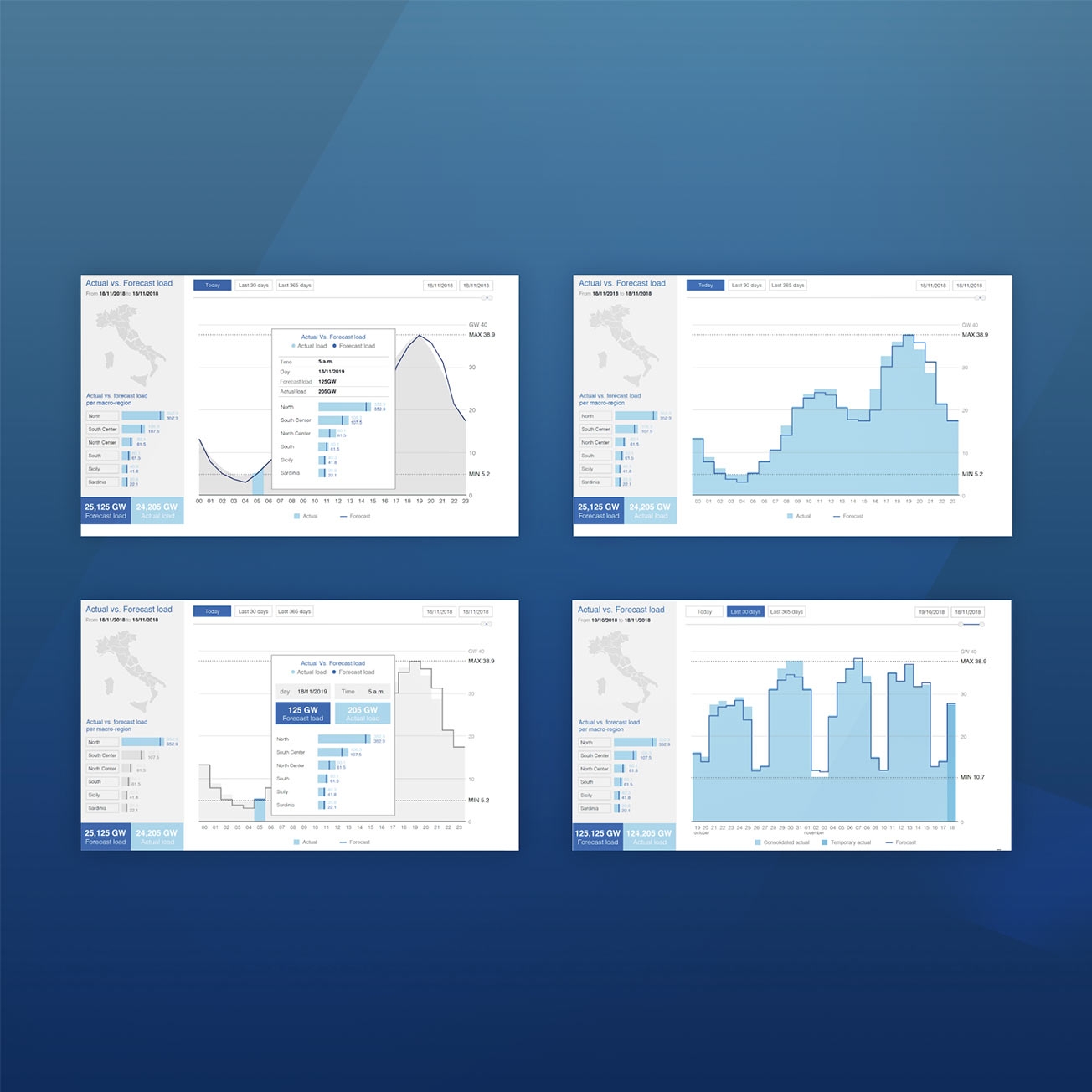
The next step was dedicated to the creation of several views, each one with different aims:
- Re-organizing the place for information
- Evaluate the efficiency of data visualization
- Evaluate the user interaction with different UI elements
Consultancy Phase 3 -
Prototype design
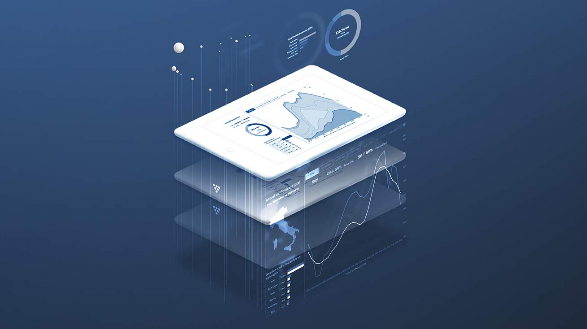
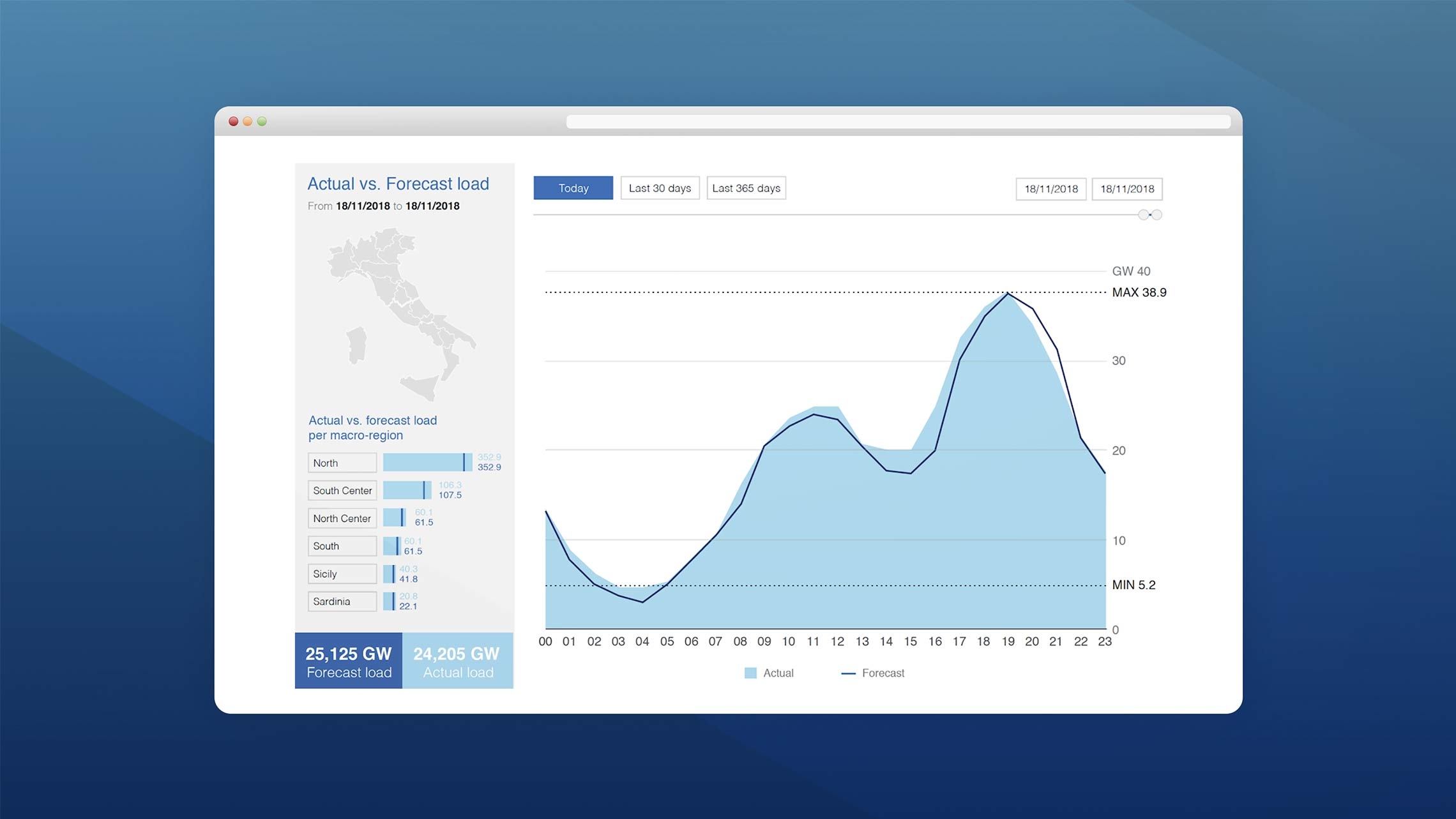
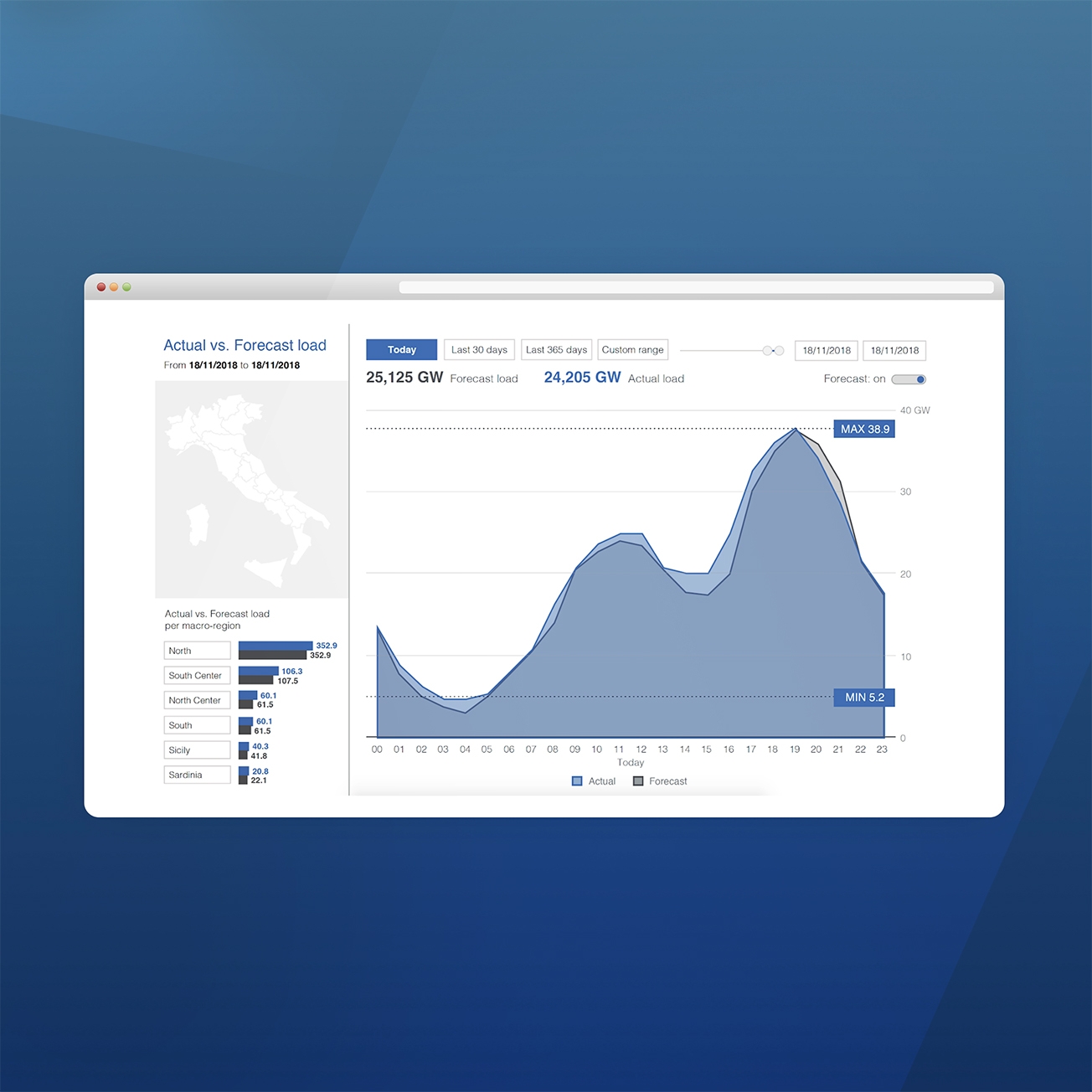
After the explorative analysis and client feedback, the prototype was designed. In this version the European Regulators Group for Electricity and Gas (ERGEG) for South Central Europe on network transparency guidelines (see EC Regulation 1228/2003) were combined with Terna’s brand guidelines to define each element of the page design. The data covered load, energy transmission and interconnection, generation and balancing.

