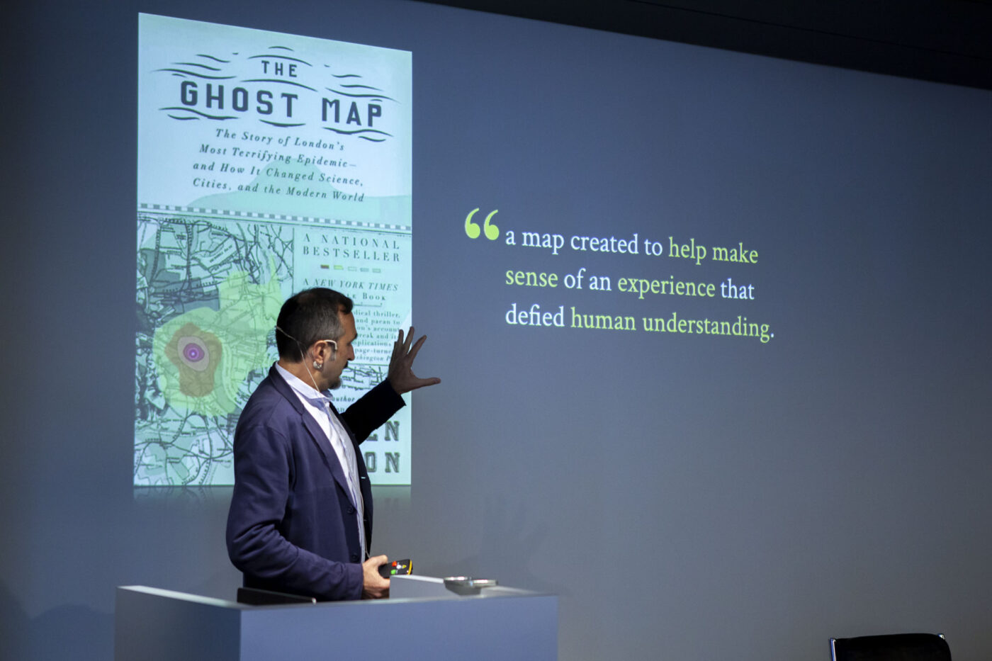
Our presentation began with an introduction by Professor Paolo Ciuccarelli, who provided historical and conceptual context for data visualization. He cited pioneering figures like John Snow, who used a map in 1854 to identify the source of a cholera outbreak in London. This case illustrates how visual data representation can reveal hidden patterns and facilitate critical decisions. Over time, data visualization has evolved from simple bar and pie charts to more complex representations such as heat maps and interactive graphs, making data comprehensible and actionable for diverse audiences.
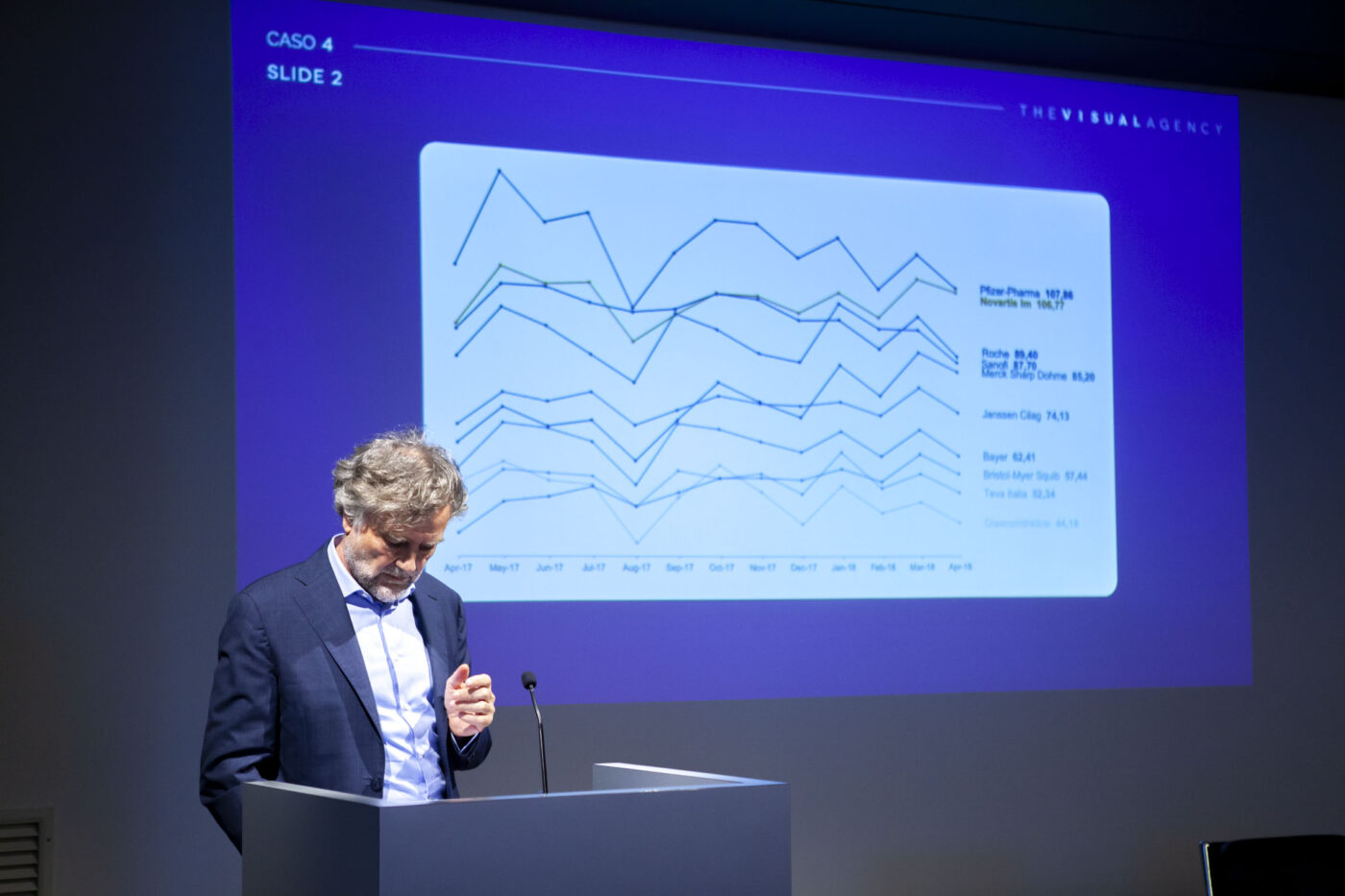
Our panel continued with a presentation by Paolo Guadagni, CEO of The Visual Agency, who demonstrated how data visualization can transform data into strategic decisions through five exemplary case studies.
The first example featured a static chart that clearly and simply compared data, in contrast to data presented in written form. The second case study involved an interactive dashboard for top management, complete with filters and KPIs, offering an overview of project statuses and enabling real-time informed decisions. The third example highlighted the importance of missing data as significant indicators, helping identify areas for improvement and untapped markets. The fourth case study emphasized the transition from data analysis to communication, stressing the importance of communicative context for stakeholders through effective infographics and visualizations. Lastly, the final example focused on promoting a data-driven culture, citing Campari’s workshops, content strategy, and communication outputs that made employees more data-aware and capable, fostering a data-centric corporate culture.
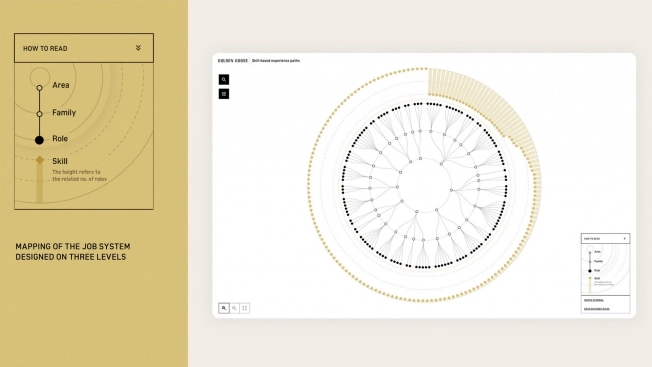
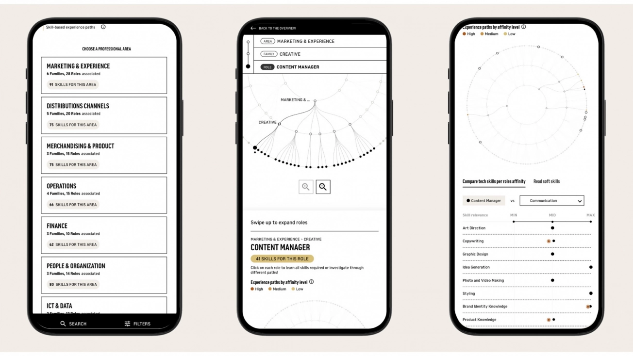
The third presentation introduced an interactive tool implemented by Golden Goose’s talent department in collaboration with The Visual Agency. This innovative platform, utilizing advanced filters, allows employees to visualize potential roles based on their skills and understand the competencies needed for various positions within the company. It provides a clear view of growth opportunities, encouraging continuous development of resources within the organization. This tool also supports corporate decision-making, facilitating informed and strategic choices for human resource development.
Another project example involving data and corporate decision-making is that of Intesa Sanpaolo. The bank’s information system contains a vast amount of data, equivalent to the information in approximately 116 billion books, or 58 petabytes of data. These data are generated by the daily operations of clients and employees and are constantly updated. The bank collects internal and external data for various purposes, such as managing bank accounts, credits, transactions, products, and payments. The digitalization has required the consolidation of a common, updated data asset, providing a unified customer view across all channels and enhancing the understanding of management and quality systems, including the use of AI.

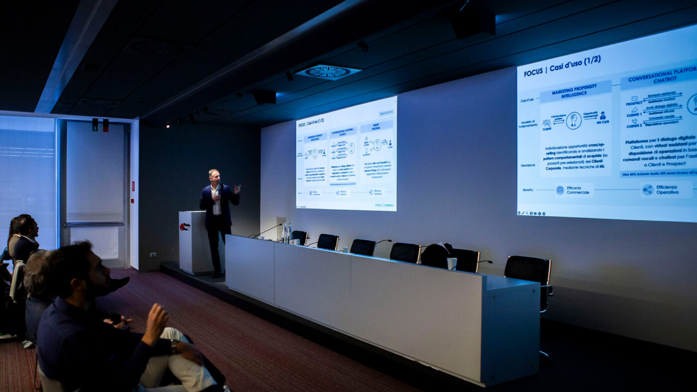
The participation of The Visual Agency in this event highlighted the growing importance of data visualization in transforming data into strategic decisions. Through historical analysis, practical case studies, and innovative tools, it became evident how visual data representation can enhance understanding, communication, and data culture within organizations, promoting informed and strategic decisions at all levels.
