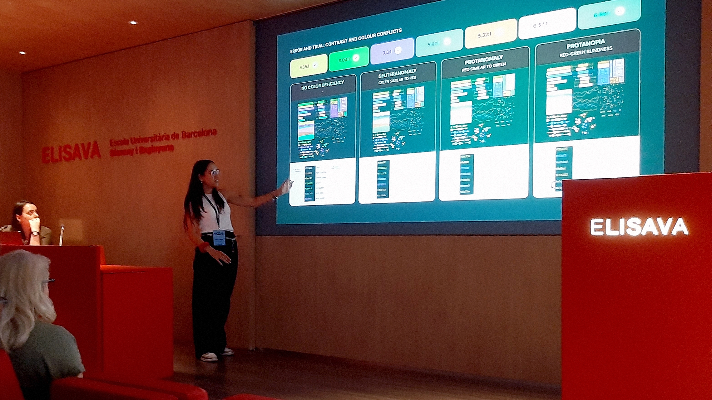
2CO Communicating Complexity is an international conference that explores new approaches and technologies to “respond to the emerging need for making complex information accessible through design”. It took place in July 2024 at Elisava Facultad de Diseño e Ingeniería, a design and engineering school on the beautiful Rambla in Barcelona, Spain.
In this context, Beatrice Bazzan and Fabiola Papini, two digital designers from The Visual Agency, were invited to present their most recent research in the field of web accessibility, addressing the question: how to define an accessible color palette when designing digital data visualizations?
From here, a process of exploration and testing began, from which more specific workflow questions emerged: What tools should we use? What rules should we follow? How can we avoid making biased choices based solely on color contrast or perception?


The presented practice involved design-based research aimed at defining guidelines for accessible color palettes that comply with accessibility standards while maintaining aesthetic identity and functionality. Recognizing the significance of color and its impact on readability and interpretation of information, the research emphasizes balancing color theory with accessibility requirements to achieve a seamless user experience for all.
While the Web Content Accessibility Guidelines (WCAG) 2.1 lay a foundation for inclusive practices in digital design, they lack specific guidelines for data visualization. To address this gap, the designers conducted comprehensive desk research, consulting various primary sources to identify patterns and understand existing approaches. Their exploration revealed that current literature also fails to establish a common practice. Designers typically focus on either color contrast or perception, but there is no middle ground or tool that addresses both. This finding underscores an undefined context, prompting designers to explore and validate appropriate practical approaches.

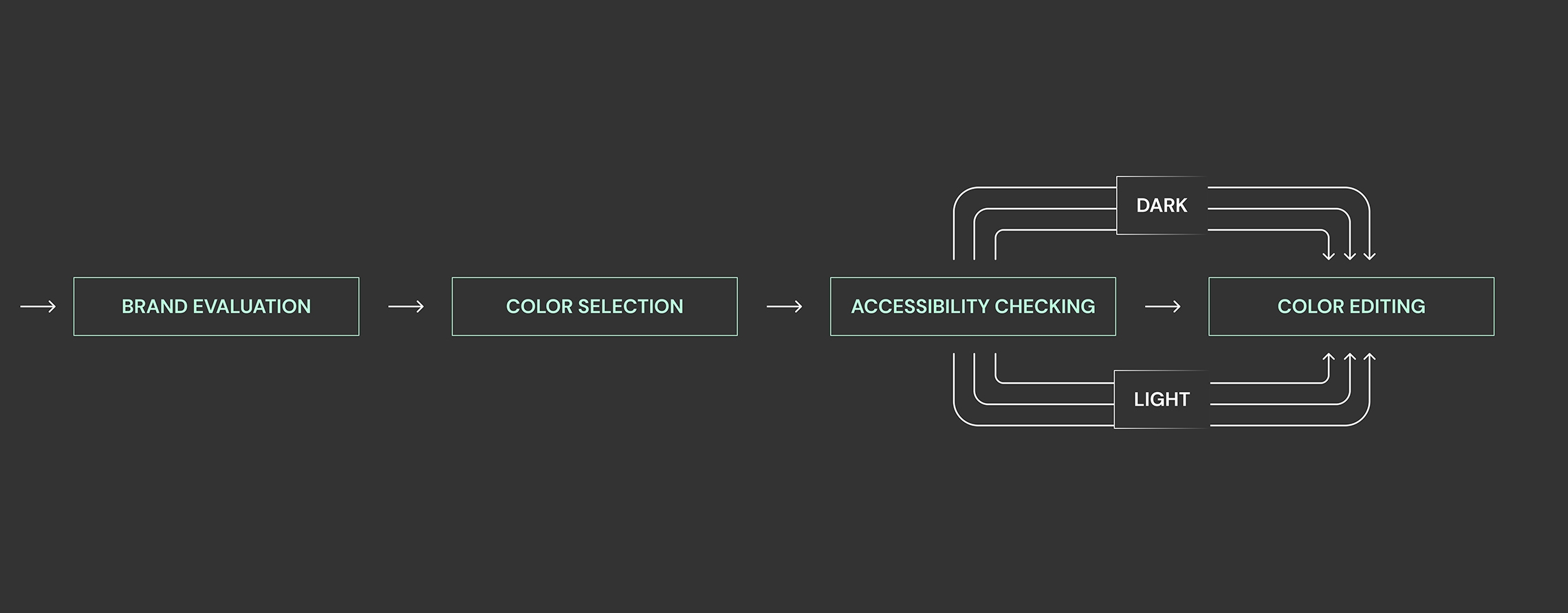
The designers presented a step-by-step methodology based on an iterative process:
- Brand Evaluation: The first step involves studying the brand guidelines to assess the importance of contrast and color. Developing a visual concept is crucial, as it not only enhances the brand's uniqueness but also effectively communicates data. Colors that deviate from the theme can signal importance to the reader.
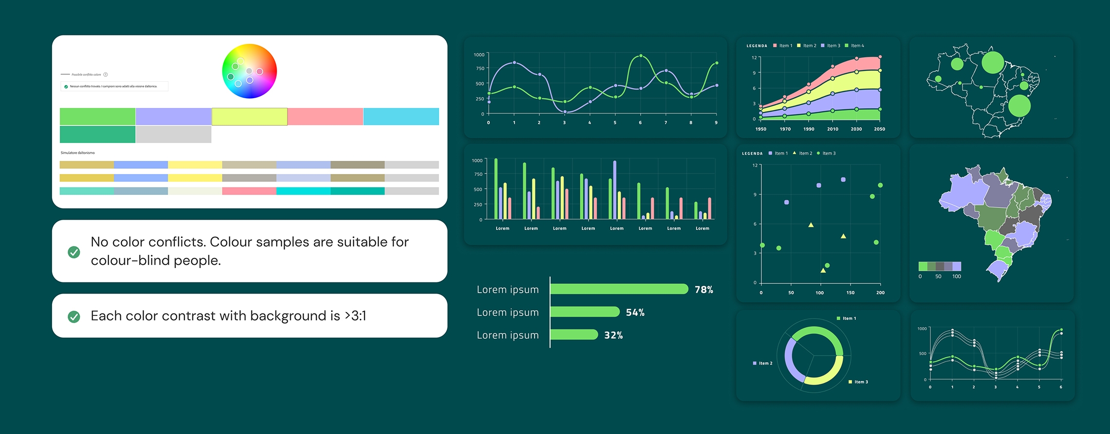
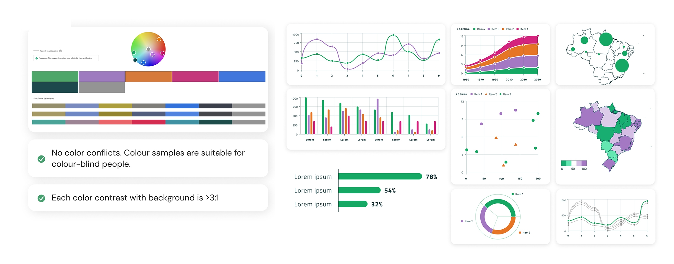
- Color Selection: Once the look and feel were consolidated, they selected the categorical colors, limiting them to seven, as literature suggests this is the limit of human visual recognition. They worked in hue, chroma, and luminance space rather than RGB.
- Accessibility Testing: The main challenge the team faced was the lack of a tool to check both color contrast and color perception, making this step particularly important for ensuring accessibility. They used a trial-and-error approach, testing contrast and color perception in parallel. Starting with a palette that ensured a contrast ratio of at least 3:1 with the background, they found difficulty distinguishing colors for all types of color blindness because the contrast ratio only measures discrimination between two colors. Using Viz Palette, which generates reports that visualize the Just Noticeable Difference (JND) between colors, they developed a palette that provides a good compromise between contrast and perception.
- Color Editing: Editing is based on color perception, contrast, and the original theme. This process is carried out twice to accommodate different palette types and the design of both light and dark modes.
The authors presented their methodology and its application on real case study projects to highlight the challenges encountered and the solutions adopted.
The work was presented to the audience alongside notable speakers such as Manuel Lima, Pau Garcia from Domestic Data Streamers, Santiago Ortiz, José Duarte (director of Easydataviz), and Nicole Lachenmeier and Darjan Hil from Superdot Studio.
This is one of the significant design challenges the digital design team is currently tackling to comply with the European Accessibility Act (EAA), a directive established by the European Union to ensure that ICT, banking, e-commerce, and transportation products and services are accessible to all individuals, including those with disabilities. Compliance with the EAA involves addressing various accessibility issues, such as making websites navigable by screen readers, providing alternative text for images, and enabling the use of assistive technologies. The digital design team must therefore conduct thorough testing and undertake redesign efforts to meet these accessibility standards, ensuring their digital products and services are inclusive and user-friendly for everyone.