Upon conclusion of EXPO Milan, Italian newspaper Corriere della Sera commissioned Oxway to conduct a survey to identify citizen’s preferences regarding the future use of the EXPO area.
The data application pulls in qualitative data based on an analysis of open-ended survey questions that organizes them into topical clusters according to the kind of proposal and sociodemographic criteria. With this visualization, users can explore and analyze each of these answers to determine the public preference for the future of the EXPO Milan area.
Objective
Visualize the alternative proposals and popular vote results of a qualitative public opinion study on what to do with the spaces of the Milan EXPO area after its conclusion.
Result
An innovative and engaging way to present and communicate the survey results allowed public opinion to influence the fate of the space, while supporting public understanding of what the favoured alternatives were.
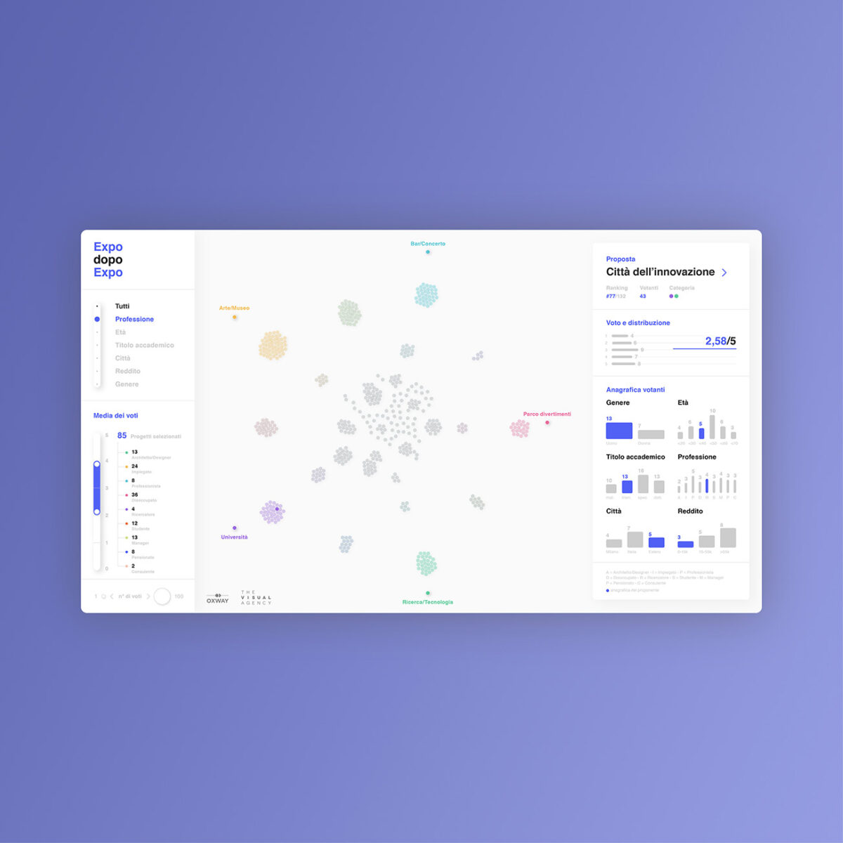
Visualization of the proposals and vote results of a public opinion study on what to do with the spaces of the EXPO area after its conclusion.
Users can explore and analyze each of these answers to determine the public’s preference for the future of the EXPO Milan area.
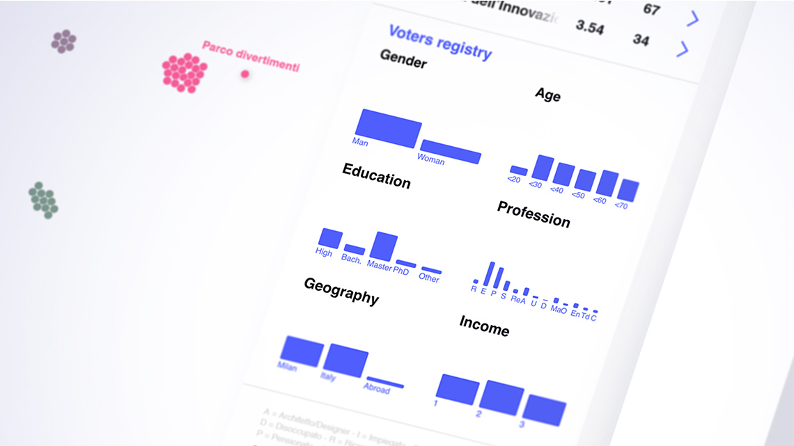
We designed an interactive application which allows the user to explore and analyze every single open-ended response through organization of answers into topical clusters according to socio-demographic criteria.
The visualization module
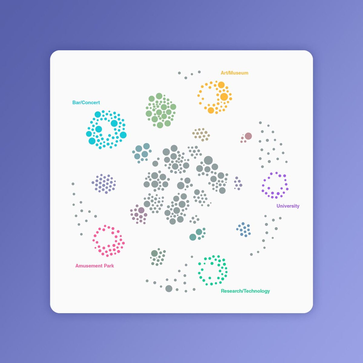
Every circle represents each one of the 977 proposals. Its position relates to its affinity with one or more of the 5 macro-categories.
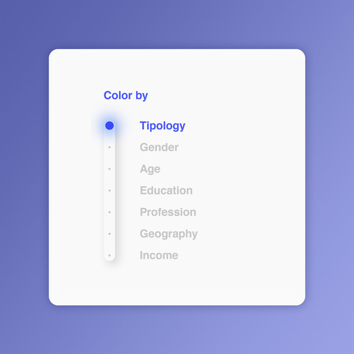
Filtering the view
Results can be filtered through different parameters. The data complexity is then translated into a color scheme.
Our Projects
Verco
Dashboards and data visualization
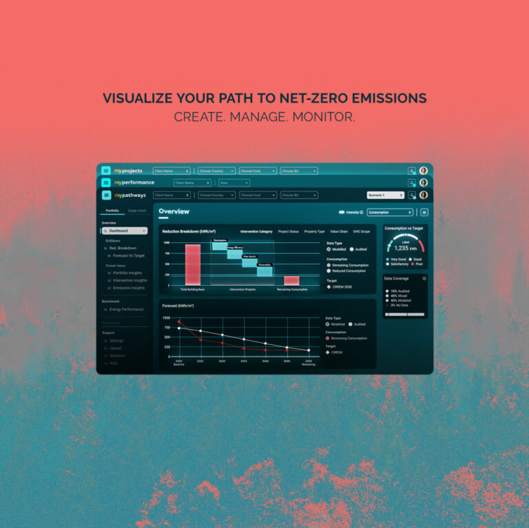
MyVerco SaaS platform for carbon accounting
The Visual Agency
Consultancy and training courses, Dashboards and data visualization
TVA Academy - Data-visualization and UX/UI training for companies
Polis Lombardia
Dashboards and data visualization
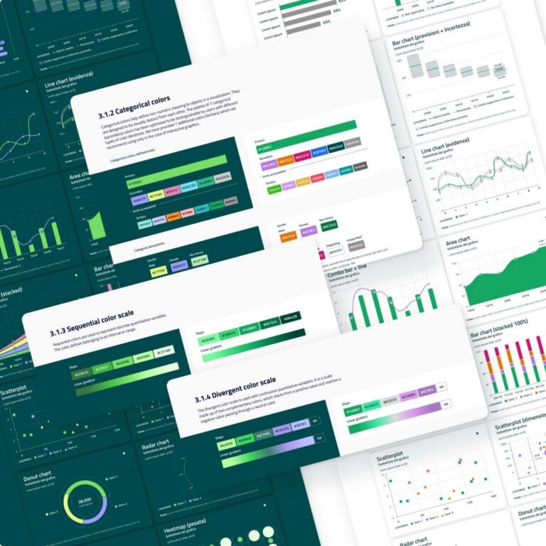
Clear and accessible data visualization guidelines for BI tools
Biblioteca Ambrosiana
Dashboards and data visualization
Decoding Leonardo Da Vinci for the world
-
Dashboards and data visualization
An interactive atlas for operational mapping
TVA
Dashboards and data visualization, Data-storytelling
A digital collection to experience Dante’s Divine Comedy
No posts found
We’d love to hear about your project! Drop us a line