Practical design guidelines
This document provides guidelines for applying principles of visual hierarchy, data contextualization, and transparency to data visualizations.
It details how to apply the client’s brand guidelines, including specific indicators for color palettes, typographic styles, and iconographic elements for both static and interactive graphs.
By explaining these principles and approaches, the document elevates the standards and ensures coherence in all data visualizations created by PoliS-Lombardia.
Accessibility of Data-visualizations
Ensuring accessible data visualization is a priority for many clients, especially public institutions.
Our guidelines include a dedicated section explaining key factors for creating accessible data visualizations. We provide detailed instructions and practical examples on selecting accessible color palettes, ensuring text readability, and making visualizations suitable for screen readers.
Additionally, the guides for PowerBI and Tableau offer specific instructions on how to make visualizations created with these tools as accessible as possible, aligning with international standards like WCAG.
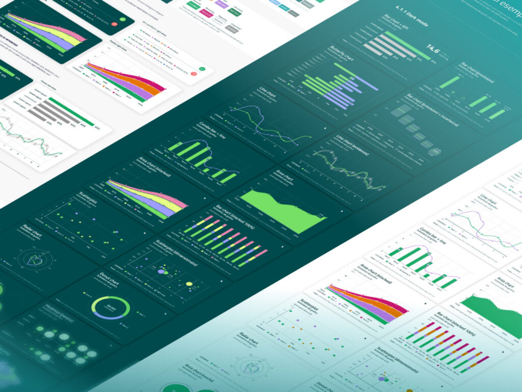
BI Templates
The guidelines feature templates of data visualizations that adhere to both accessibility standards and the client’s brand guidelines. These templates, designed for seamless integration with PowerBI and Tableau, ensure rapid adoption and promote a consistent visual language across all visualizations.
The document also provides examples and detailed instructions for creating complex visualizations and maps in both tools. It offers step-by-step guidance on how to replicate intricate static and interactive visualizations, enabling users to create sophisticated and highly functional visual content. This ensures a high level of technical and visual consistency across all projects.