Consultancy and training courses, Dashboards and data visualization
Visualize data with a specific software solution - Power BI
Description
Background
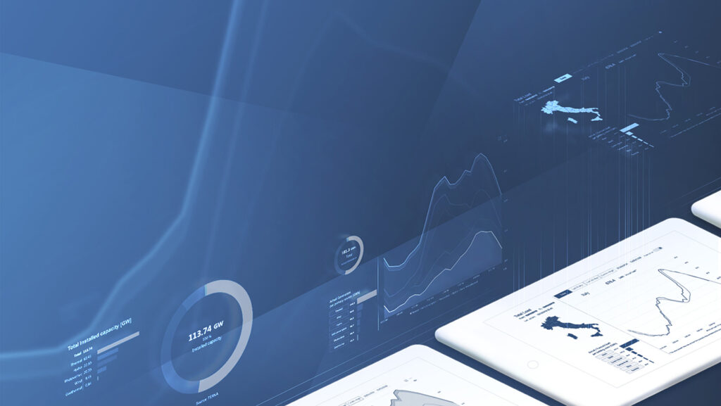
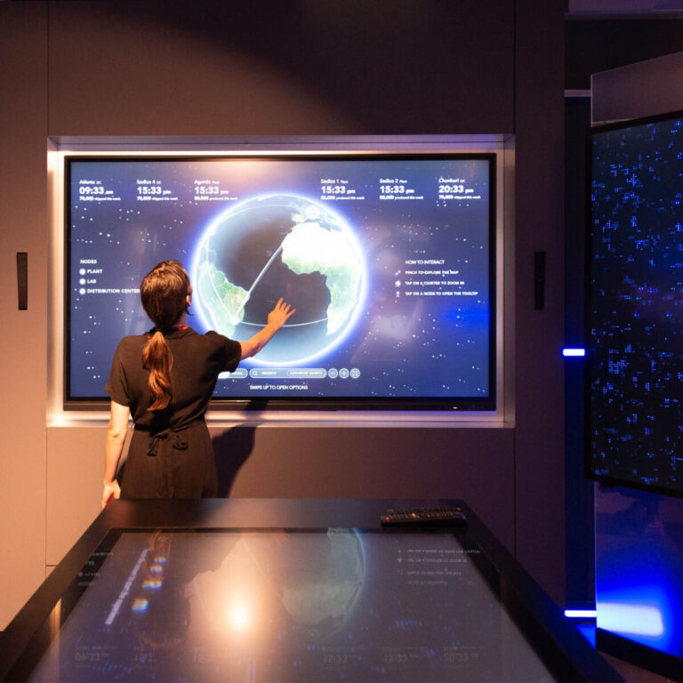
Terna’s vast network acts as a powerful data source showcasing how energy is transformed from primary sources into electricity, covering load, generation and transmission.
One of the client’s requirements was the adoption of Microsoft’s PowerBi as the only tool to be used for the visualization of their data. The information design consultancy was the first-step in our collaboration, allowing a deeper understanding of the data, client needs and education gap. This was followed by a detailed reorganization and positioning of the information available, improving and enriching the way data was represented in Terna’s interactive and public dashboards.
Objective
Create a useful and elegant set of visualizations to communicate information on energy production and consumption.
Result
The consultancy on data visualization allowed the client to build a more effective and usable product using Microsoft PowerBi, the standard data-visualization technology adopted by Terna.
Terna’s consultancy was split into three different phases to analyze, conceptualize and design the project in partnership with the client.
Our focus was on understanding the data information and data organization scenarios, followed by an assessment of different alternatives and finally prototype design. Read further to understand each phase.
Year:
2021
Industry:
Energy
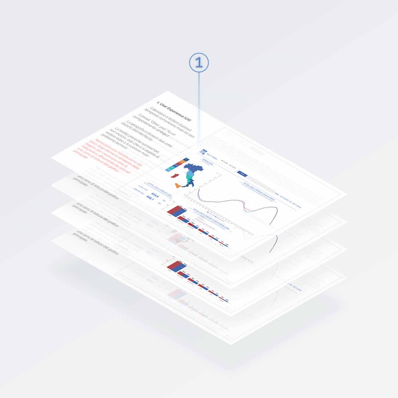
Consultancy Phase 1 -
Analyzing the state of the art
The project started off with an assessment of the client’s prototypes and included the reorganization and positioning of the information available, the improvement of the effectiveness of the visualizations used and their usability for the reader.
Our analysis was divided into four macro-areas:
User Experience (UX)
User Interface (UI)
Data Visualization
Copywriting
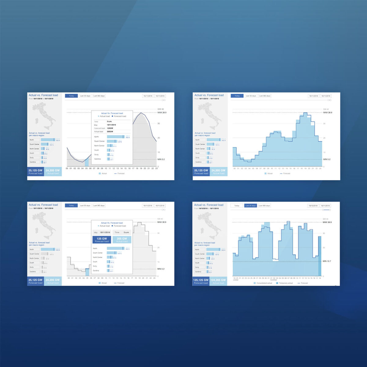
Consultancy Phase 2 -
Exploring possibilities
The next step was dedicated to the creation of several views, each one with different aims:
Re-organizing the place for information
Evaluate the efficiency of data visualization
Evaluate the user interaction with different UI elements
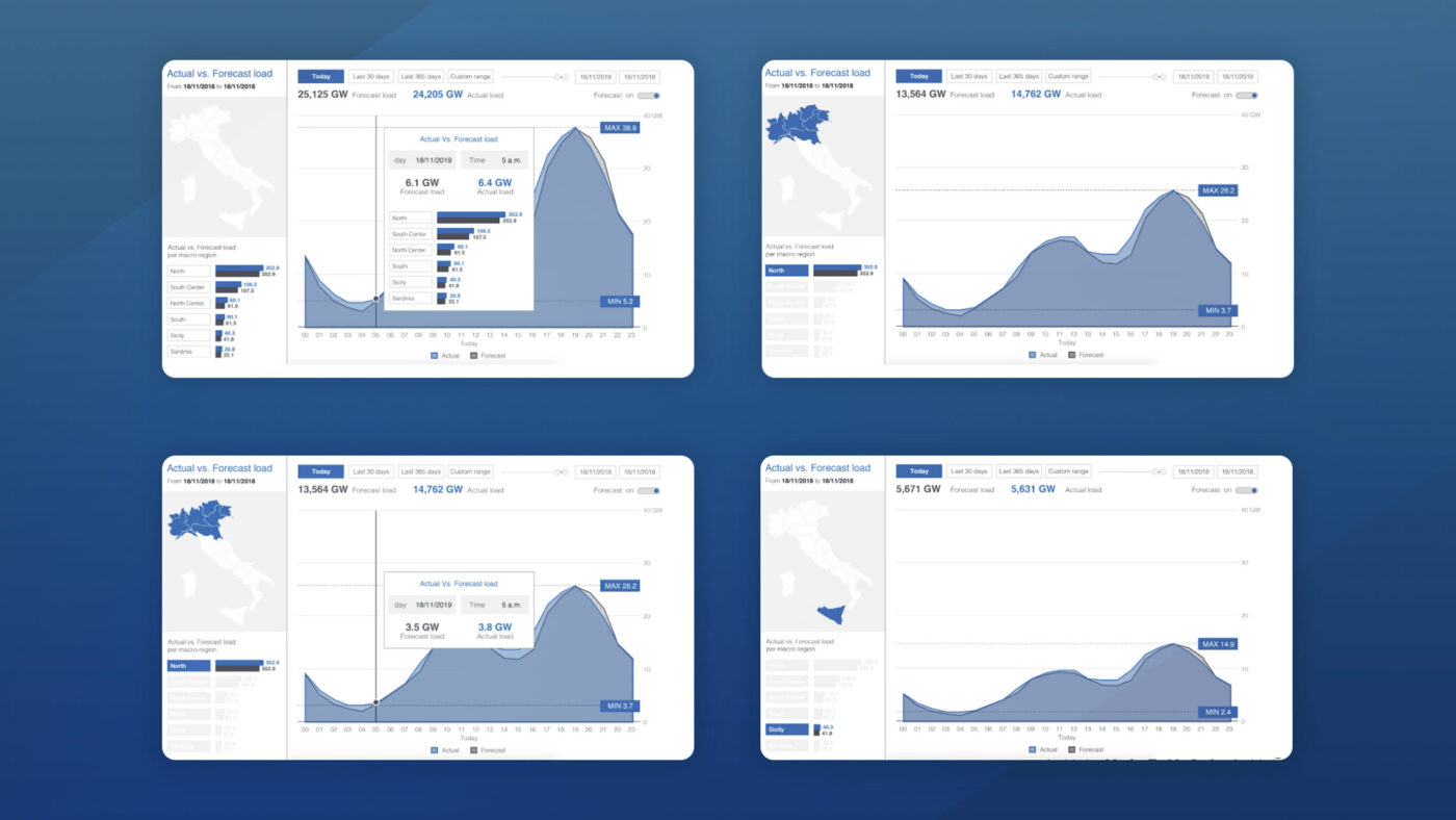
Consultancy Phase 3 -
Prototype design
After the explorative analysis and client feedback, the prototype was designed. In this version the European Regulators Group for Electricity and Gas (ERGEG) for South Central Europe on network transparency guidelines (see EC Regulation 1228/2003) were combined with Terna’s brand guidelines to define each element of the page design. The data covered load, energy transmission and interconnection, generation and balancing.
Our Projects
Verco
Dashboards and data visualization
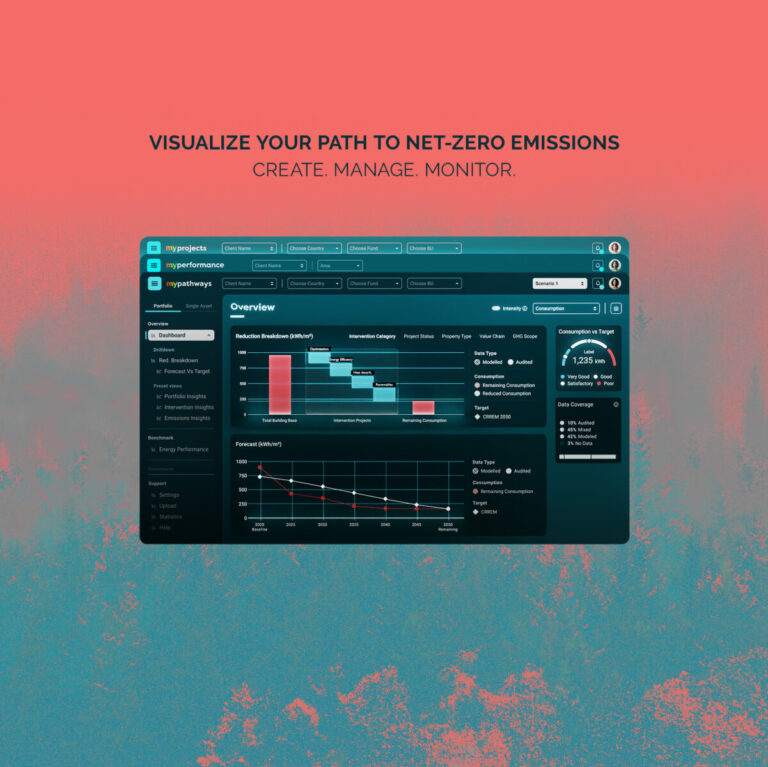
MyVerco SaaS platform for carbon accounting
The Visual Agency
Consultancy and training courses, Dashboards and data visualization
TVA Academy - Data-visualization and UX/UI training for companies
Polis Lombardia
Dashboards and data visualization
Clear and accessible data visualization guidelines for BI tools
Biblioteca Ambrosiana
Dashboards and data visualization
Decoding Leonardo Da Vinci for the world
-
Dashboards and data visualization
An interactive atlas for operational mapping
Campari
Consultancy and training courses, Data-storytelling, Motion graphic videos
Campari Group: promoting a corporate data culture
No posts found
We’d love to hear about your project! Drop us a line