Consultancy and training courses, Dashboards and data visualization
TVA Academy - Data-visualization and UX/UI training for companies
Description
Background
Based on TVA’s decennial experience training 50+ clients and 1000+ people, this tool agnostic course covers visual variables, sketching, and chart selection. Learn decluttering, storytelling, maps, and accessibility. The training can be integrated with UX/UI segments focused on dashboard design and data-storytelling. Participants also master advanced charting, complex visual models, and interaction design, ensuring best practices for professional and impactful results.
Objective
Help employees to master data storytelling, data-viz best practices, and UX/UI principles to build coherent dashboards and communicate numbers with impact.
Result
Tailored dataviz & optional UX/UI training course to master chart selection, storytelling, and accessibility. Elevate professional skills with advanced techniques.
Data-viz is the core module of the training. Two domain experts lead theory and practical exercises. UX/UI is an optional add-on. We offer 4-8h live sessions or a 1h video course (8 pills). The structure is flexible and delivered online or in person by our experts, balancing frontal lectures with hands-on exercises for all participants.
Year:
2026
Industry:
Business Consulting and Education & Culture
The training can be integrated with inspirational talks from leading domain experts or complementary projects such as data-visualization design systems or expert review of existing material.
The core structure
Data-viz is the core module of the training. Two domain experts lead theory and practical exercises. UX/UI is an optional add-on. We offer 4-8h live sessions or a 1h video course (8 pills). The structure is flexible and delivered online or in person by our experts, balancing frontal lectures with hands-on exercises for all participants. The training can be integrated with inspirational talks from leading domain experts or complementary projects such as data-visualization design systems or expert review of existing material.
Learn Data visualization
In this core module of the training course, our experts lead theory, exercises and group reviews. The topics are: what the history of data visualization can teach us, hands-on data sketching on visual variables and chart choice, chart do’s/don’ts, decluttering, and data storytelling. Starting from a base course content, additional topics like geographical and advanced visualizations can be included in the training syllabus. This flexible structure blends frontal lectures with hands-on exercises , both online or on-site. Experts ensure high-quality feedback throughout the course.
Learn UX/UI Design
Led by our experts, the session covers UX vs. UI, understanding the user, and digital design principles. It is tool-agnostic; techniques apply to PowerBI, PowerApps, or any platform. Key topics include principles of User Interface and User Experience, accessibility, interaction with dataviz This flexible segment ensures dashboards are functional and user-centric, adapting perfectly to your team’s specific needs.
Participants
Our course structure is meticulously tailored to the number of participants, ensuring high-quality delivery. We recommend groups of up to 15 people for in-person sessions and 10 for online delivery. As each program is custom-designed, we adjust the content to match your team’s specific experience level. Importantly, both segments are tool-agnostic; the acquired knowledge applies universally to PowerBI, PowerApps, Tableau, or any other platform. Guided by our expert duo, the training remains flexible to your needs, focusing on principles over software.
Our Projects
Verco
Dashboards and data visualization
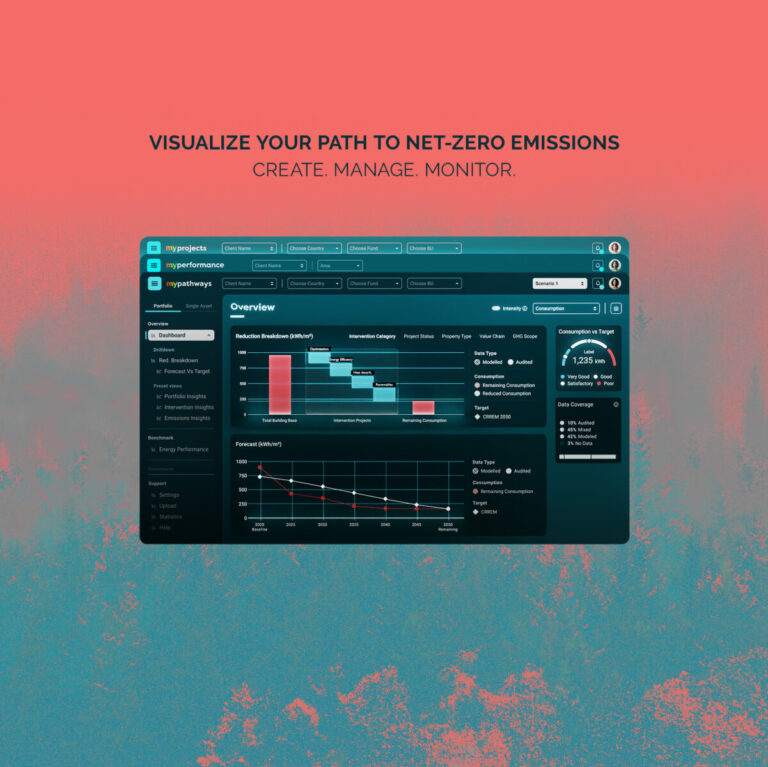
MyVerco SaaS platform for carbon accounting
Polis Lombardia
Dashboards and data visualization
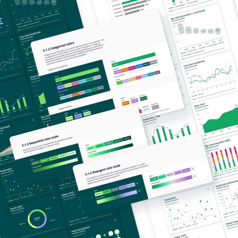
Clear and accessible data visualization guidelines for BI tools
Biblioteca Ambrosiana
Dashboards and data visualization
Decoding Leonardo Da Vinci for the world
-
Dashboards and data visualization
An interactive atlas for operational mapping
Campari
Consultancy and training courses, Data-storytelling, Motion graphic videos
Campari Group: promoting a corporate data culture
TVA
Dashboards and data visualization, Data-storytelling
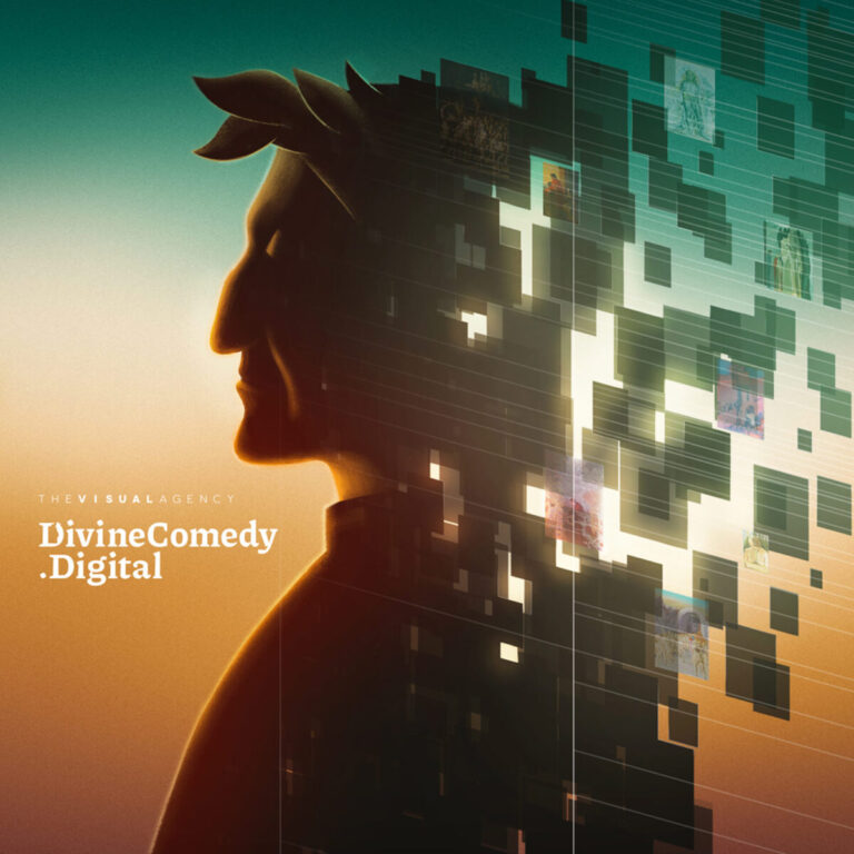
A digital collection to experience Dante’s Divine Comedy
No posts found
We’d love to hear about your project! Drop us a line