The project involved several phases: the design and development of the user interface, the analysis of the large amount of data available (millions of data records that have been collected by cookies) and the development of the API to connect to the Mediaset database.
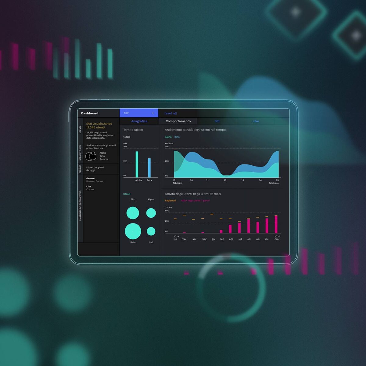
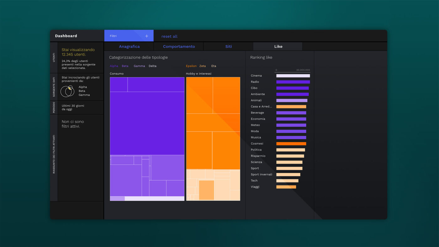
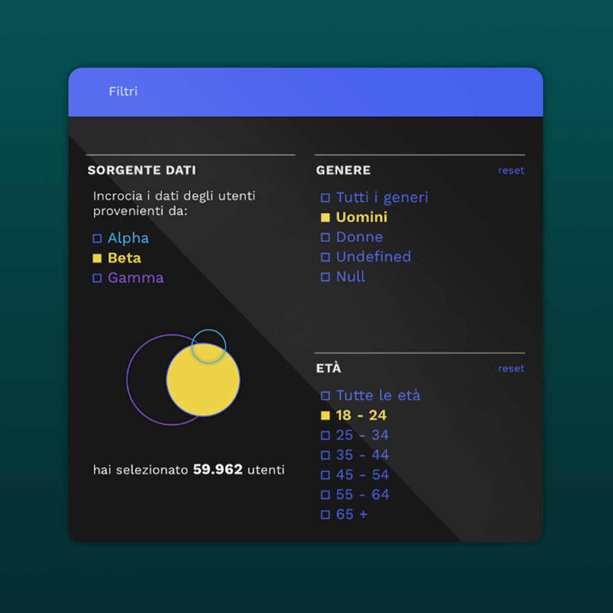
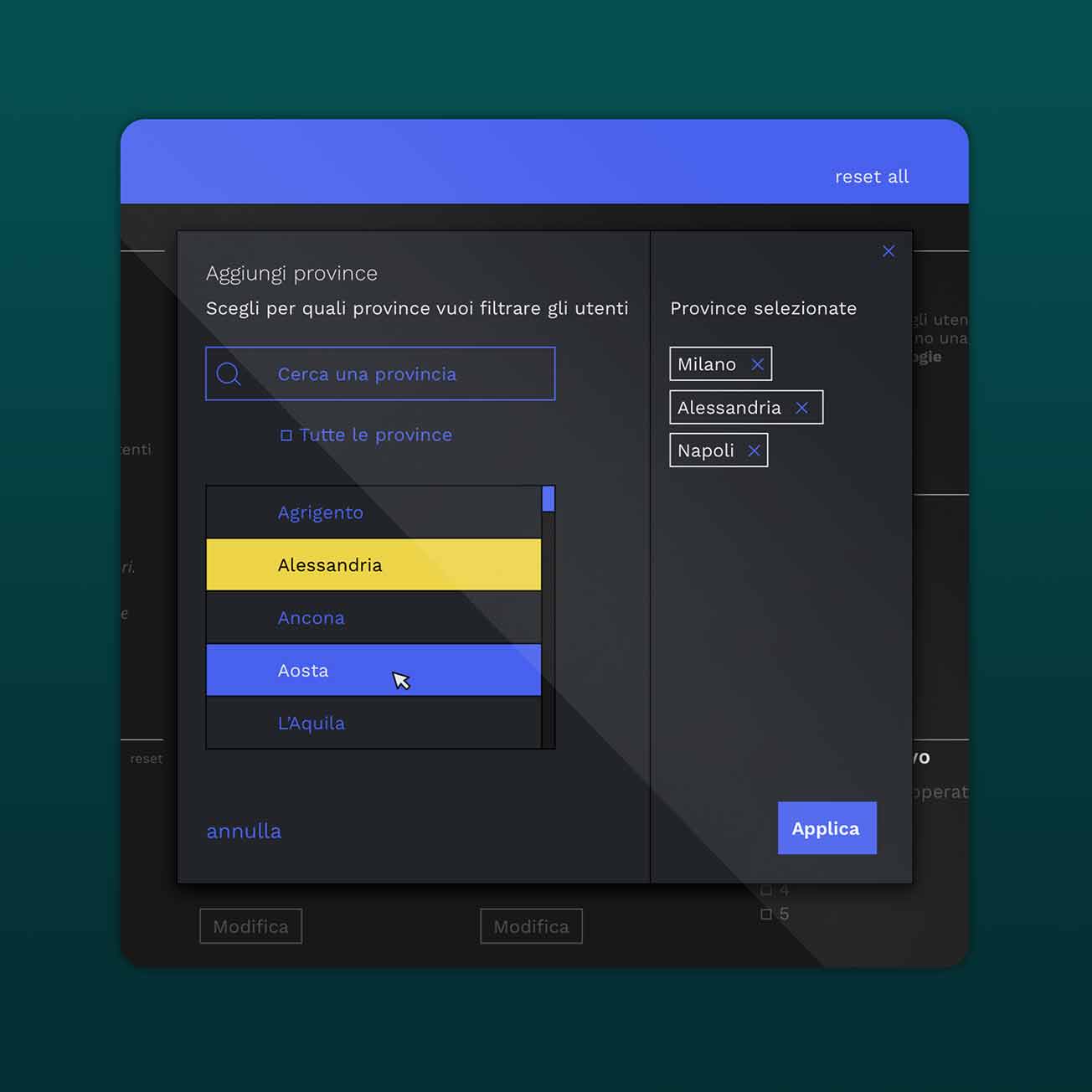
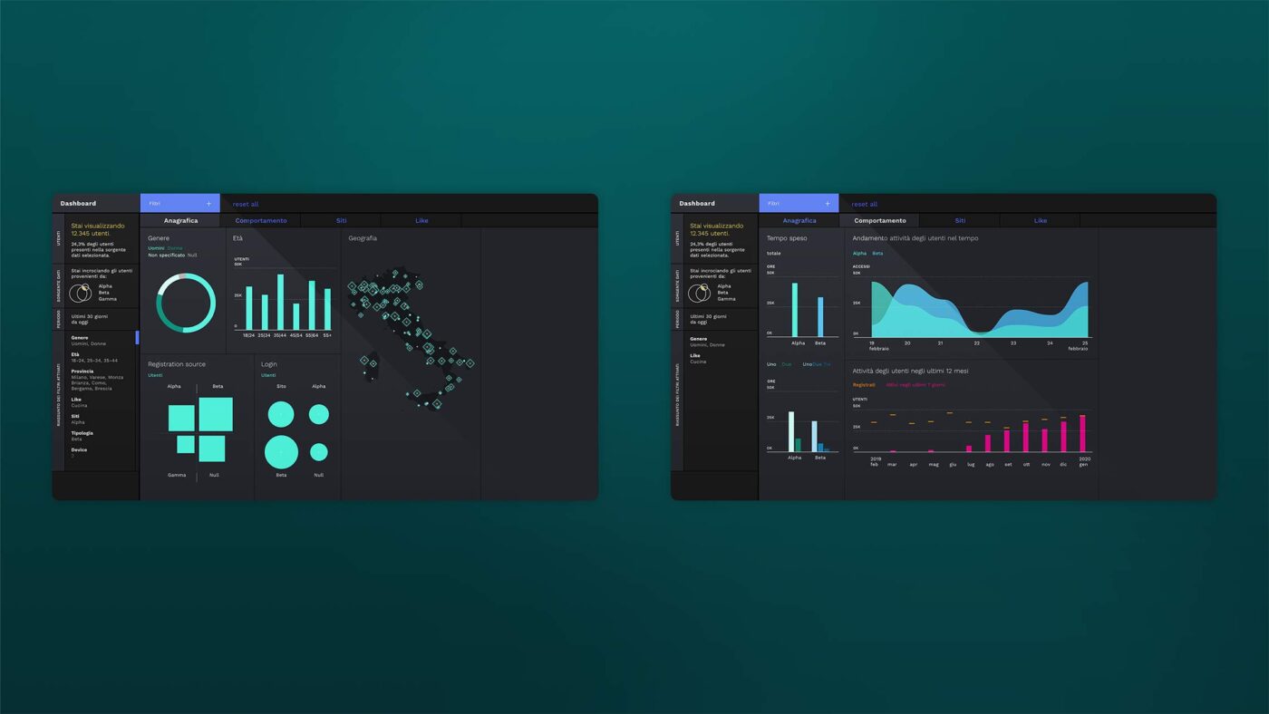
The audience data is presented with key demographic filters such as age, location, device, source of registration and the login provider to offer a full overview of the consumer journey, as well as weighting of core interest areas in the media consumed.
The project required active cooperation with both the IT department and end-users to create a full project. The application is now available for broad internal use on the television group’s intranet.
Objective
To better analyze the socio-demographic characteristics of the viewers of Mediaset’s TV online properties.
Result
The realization of a tailored dashboard, based on the aggregated data of millions of active users, that provided Mediaset with the power to optimize broadcasting by tracking preferences, habits and interests across the station’s programming.
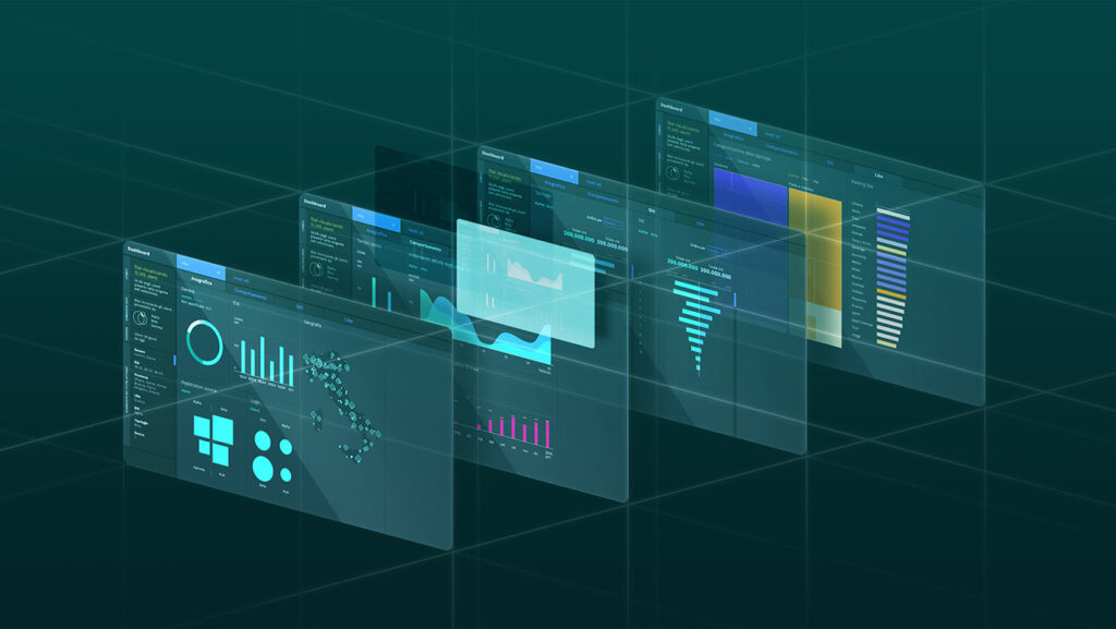
The dashboard’s interface design has been inspired by technological instruments and reinterpreted using a style that leans towards the digital world.
Year:
2020
Industry:
Media & Entertainment
The dashboard design
The different shades and scales of black exalt the spaces between the different graphs and the color selection. The use of outline borders for the graphs and the sans serif font are equally important for the user experience and user friendliness of the dashboard’s design.
The accessibility
The black background has been chosen to create a more friendly environment for the eyes, which is especially important if the user needs to work with the dashboard for longer periods of time.
A user–friendly design
The rationale behind these specific design choices was to create an environment that facilitates the analysis and exploration of the data.
Visualizing the information
The landing page gives all the necessary background information about the three user types of the dashboard. All filters have been organized on a dedicated page with a special navigation bar to see all available filters at one glance. This allows for getting a general overview before further drilling down into the dataset using other functions.
Our Projects
Verco
Dashboards and data visualization
MyVerco SaaS platform for carbon accounting
Polis Lombardia
Dashboards and data visualization
Clear and accessible data visualization guidelines for BI tools
Biblioteca Ambrosiana
Dashboards and data visualization
Decoding Leonardo Da Vinci for the world
-
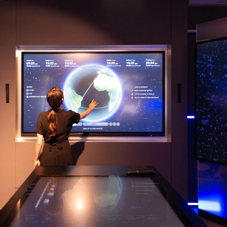
Dashboards and data visualization
An interactive atlas for operational mapping
TVA
Dashboards and data visualization, Data-storytelling
A digital collection to experience Dante’s Divine Comedy
Terna
Consultancy and training courses, Dashboards and data visualization
Visualize data with a specific software solution - Power BI
No posts found
We’d love to hear about your project! Drop us a line