A public and mobile-friendly dashboard
As the operator of the entire national electricity grid, Terna produces and collects massive amounts of data on a daily basis. In addition to exploiting the potential of this data to improve decision-making processes and implement new business strategies, the company felt the need to put it at the service of the community and stakeholders. This is how Terna4Green was born: a public, free and mobile-friendly dashboard.
CO2 Savings
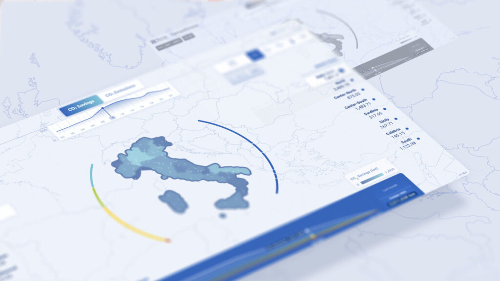
After an introduction that contextualizes the project, it is possible to access two different visualizations. The first is called ‘CO2 Savings’ and shows the tons of carbon dioxide saved at each hour of the day thanks to the production of renewable energy from zero emission sources. In the section on the left, individual sources can be selected to observe their impact compared to the total.
CO2 Emissions
Switching to the ‘CO2 Emissions’ view, it is possible to visualize the tons of carbon dioxide emitted into the atmosphere as a result of thermoelectric production, divided according to the main fuel classes. The filters on the left allow the users to identify the types of fuel with the highest emissions and their location in the Italian market areas.
Real-time data
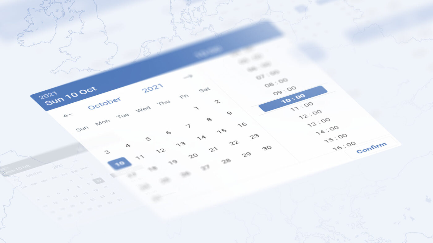
Terna4Green makes it possible to carry out real-time analysis. Thanks to the constant update, users can visualize hour-by-hour data, using a filter to select the specific day and time range they want to examine, while an overlay graph makes it possible to view the daily trend at a glance.
Weather variables and Market Zones
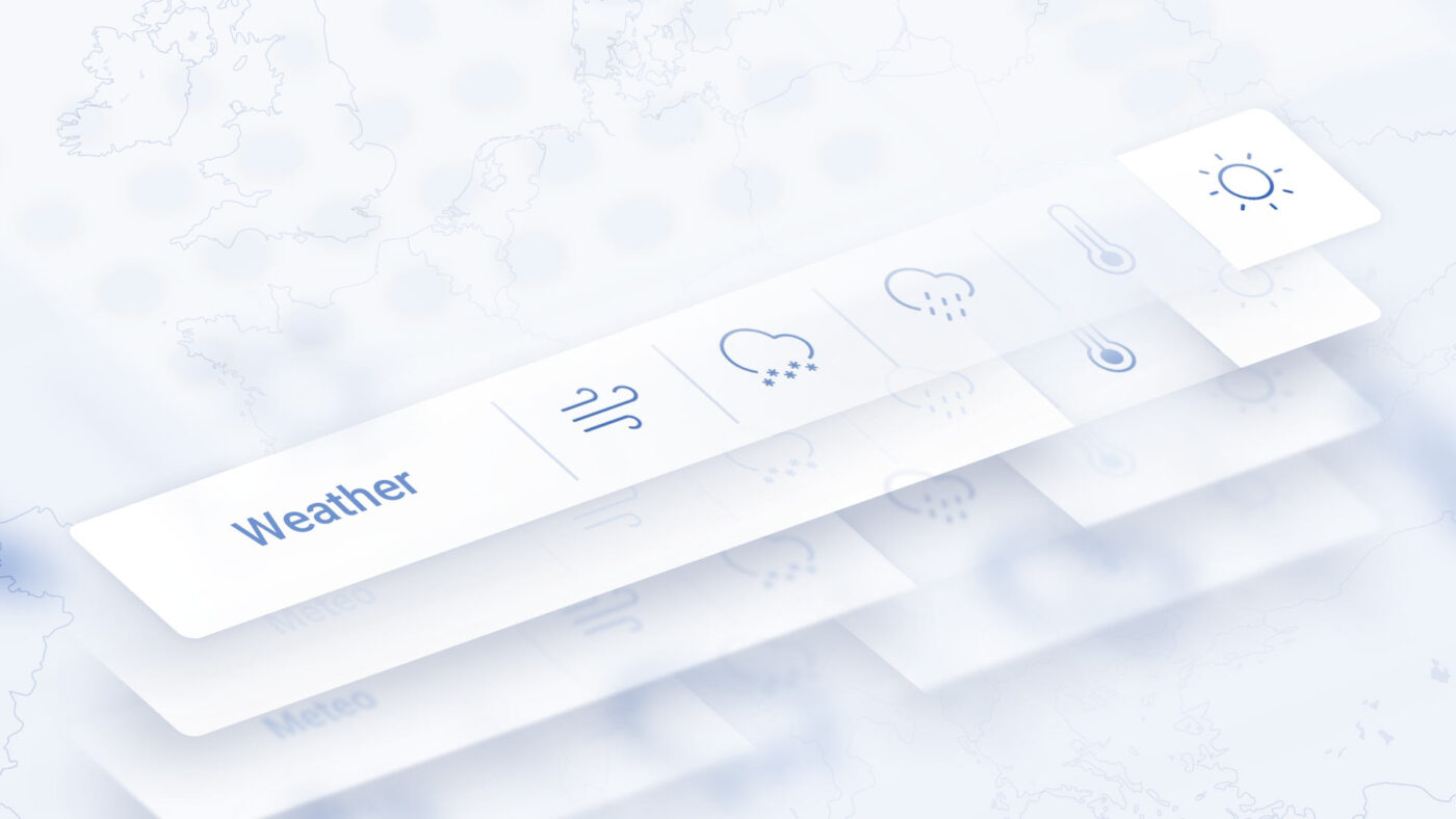
On the right hand side of the platform there is a meteorological selector, which allows users to observe the correlation between emission savings and individual atmospheric factors: temperature, rain, solar radiation, wind and snow. In addition, the division of the territory by market zones can be used to observe specific values.
A look to the past
The ‘Historical and Comparison’ dashboard aggregates the data on a daily, monthly or yearly basis, visualizing its trend with a line chart, or comparing it through a stacked bar chart. In addition, the bubble chart at the bottom of the dashboard allows a more precise visualization of the data, making navigation extremely flexible and intuitive.
