The World Mapped: how 9 Diagrams shaped our understanding of reality
Diagrams are far more than technical drawings or abstract symbols. They are visual frameworks that have shaped how we read the world — from the intricacies of the human body to the forces driving global economies.
Year:
December 15, 2025
Type:
Articles
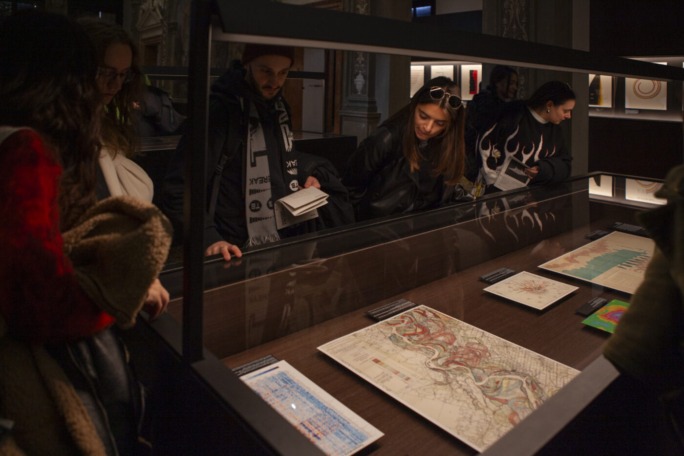
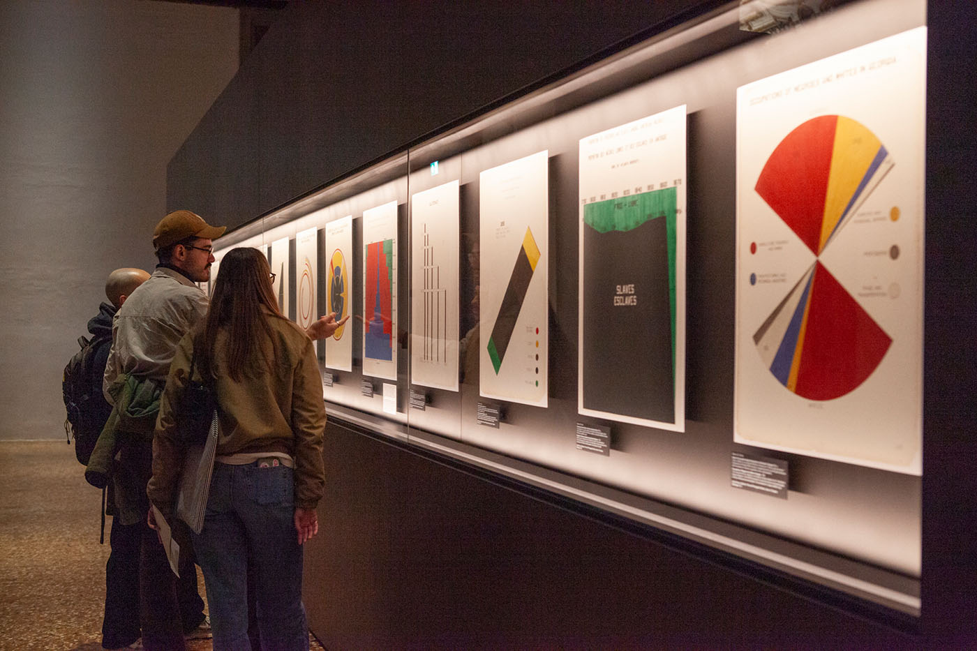
Diagrams are far more than technical drawings or abstract symbols. They are visual frameworks that have shaped how we read the world — from the intricacies of the human body to the forces driving global economies. As part of our team education journey, we visited “Diagrams: A Project by AMO/OMA” at Fondazione Prada, an exhibition that reveals just how deeply these visual tools influence the way we think, decide, and behave.
Across nine thematic areas, the exhibition shows how diagrams have become indispensable — and at times controversial — devices for translating complexity into understanding.
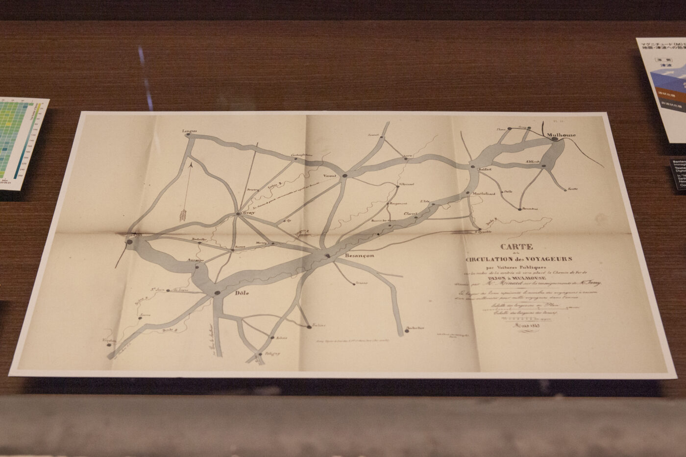
1. The Built Environment: making structure visible
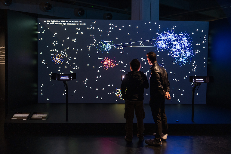
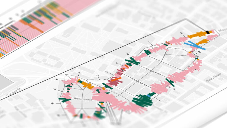
As cities grow more layered and dynamic, diagrams help decode how they function. They guide land surveys, visualize pollution patterns, and map the social structures that define urban life. Beyond documenting, they also shape action: from optimizing traffic to managing energy use. Yet the same tools can reinforce boundaries or legitimize exclusion when used with biased intent.
Photo: Carte de la circulation des voyageurs by Charles Minard
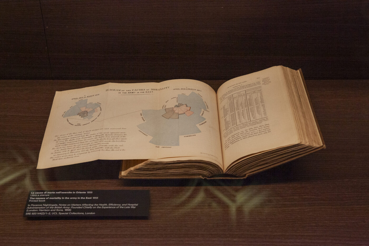
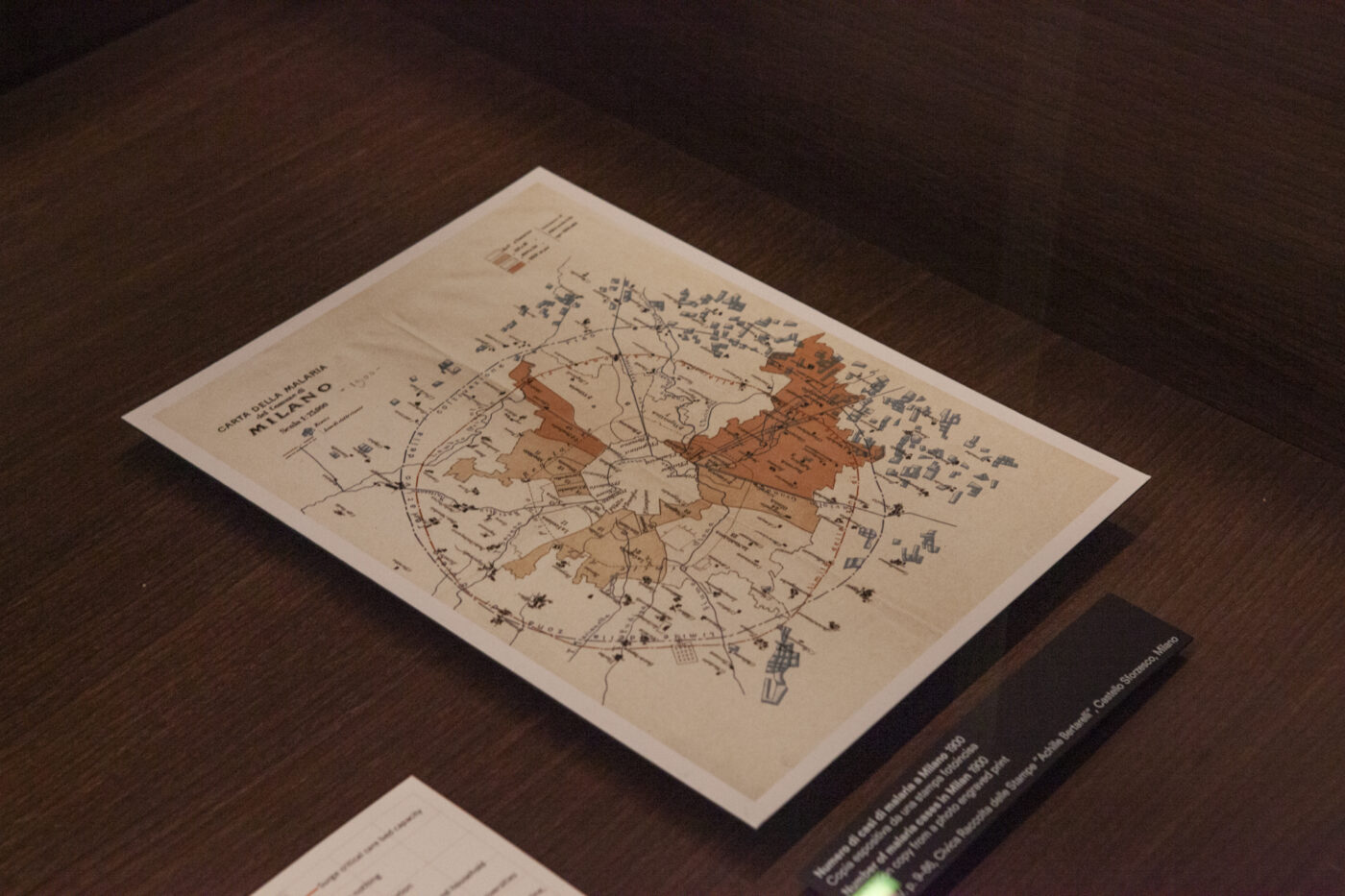
2. Health: from ancient insight to modern imaging
For centuries, diagrams have framed our knowledge of the human body. From medieval Islamic anatomy manuscripts to state-of-the-art scans, they have influenced medical education, public health, and cultural narratives around disease. The exhibition highlights how diagrams not only reflect scientific paradigms, but sometimes challenge them — exposing the tension between data, belief, and evolving medical thought.
3. Inequality: visualizing difference
Since the birth of social sciences, diagrams have mapped disparities in wealth, opportunity, and rights. They raise awareness and advocate for change — but they can also distort, oversimplify, or mislead. The exhibition revisits historic misuses, such as Lombroso’s pseudo-scientific criminology, revealing how easily visuals can embed prejudice under the guise of objectivity.
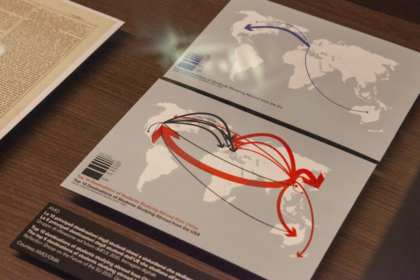
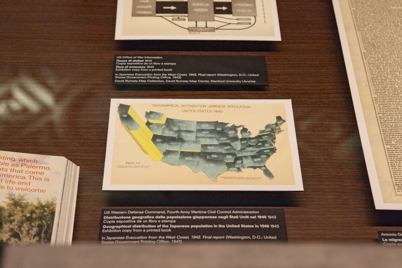
4. Migration: drawing movement
Migration is a fundamental feature of life, shaped by climate, politics, and survival. Diagrams have long traced these movements, helping us understand the forces behind displacement. Today, they model future flows triggered by global warming, conflict, and economic instability — transforming human movement into visual narratives that policymakers rely on.
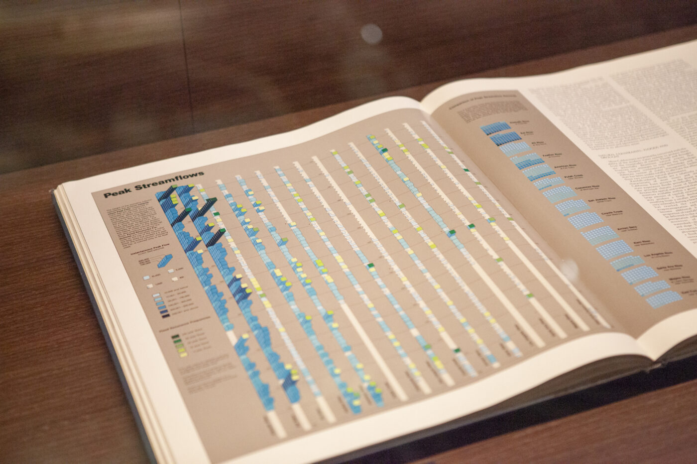
5. Environment: mapping a fragile balance
As environmental crises intensify, diagrams become essential tools for illustrating natural systems and clarifying our relationship with the planet. They make data accessible, raise awareness, and support decision-making on issues such as climate change and biodiversity loss. Their strength lies in turning complexity into clarity — a critical need in today’s ecological landscape.
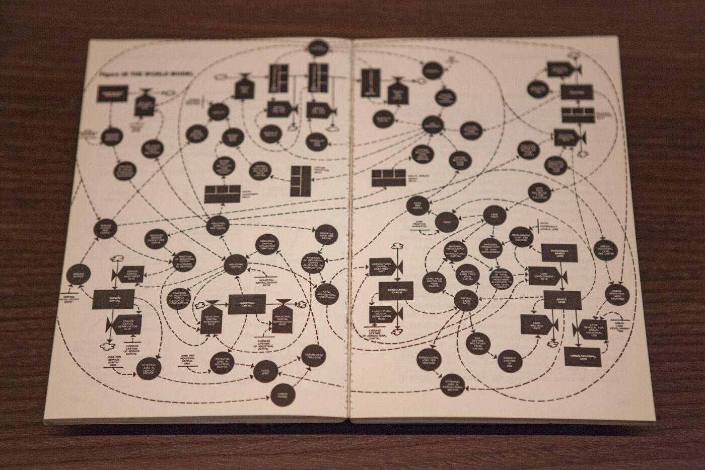
6. Resources: the cost of progress
The industrial age brought unprecedented extraction of natural resources. Early diagrams tracked deposits and maximized production, reinforcing the idea of infinite growth. From the 1970s onward, they shifted focus: highlighting depletion, modeling scarcity, and guiding the transition toward renewable energy. Theirevolutionmirrorsourchangingviews on sustainability.
7. War: the abstraction of conflict
Diagrams have long shaped military strategy — mapping troop movements, weapon ranges, and battle logistics. Today, AI-driven models simulate real-world attacks. But the abstraction inherent in these visuals removes the human dimension, obscuring the lived reality of both victims and combatants. The exhibit invites viewers to question what these diagrams reveal — and what they omit.
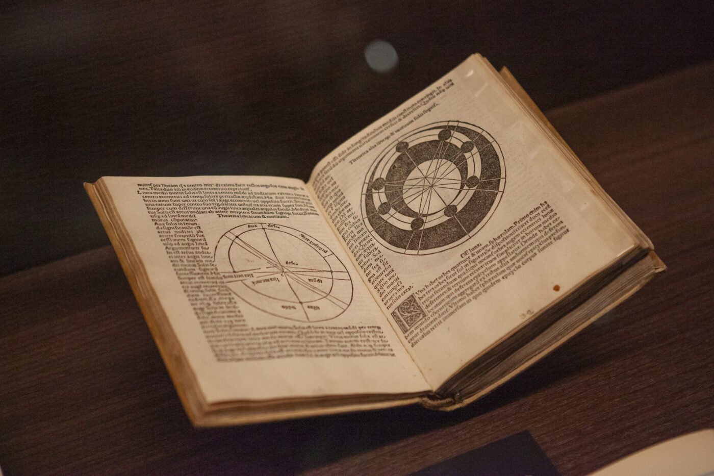
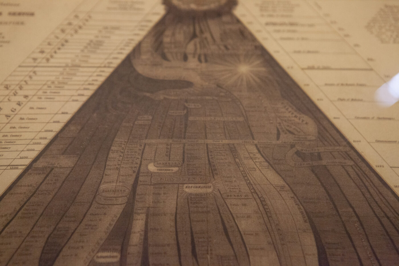
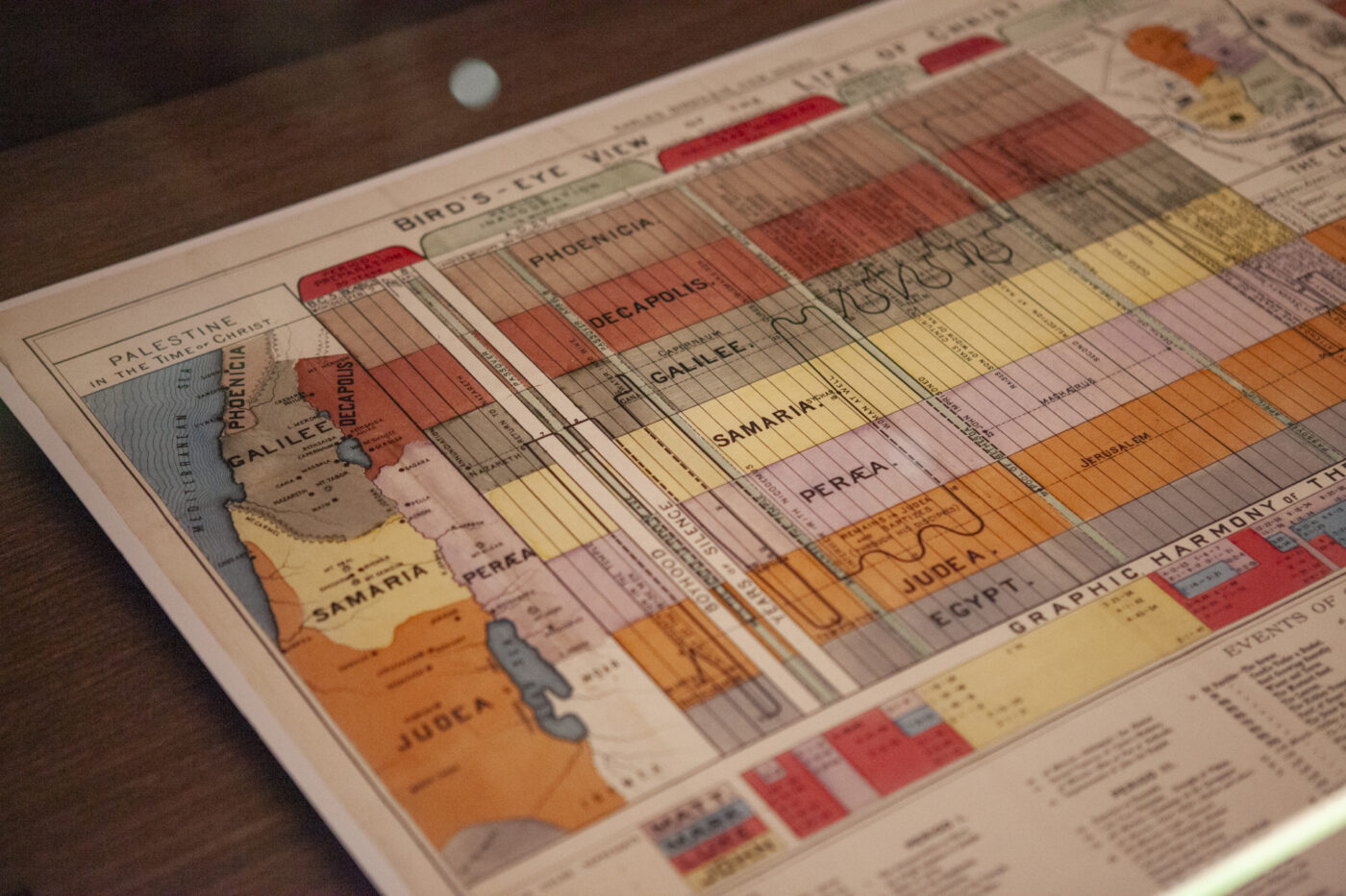
8. Truth: navigating facts and interpretation
Across disciplines — from astronomy to religion to history — diagrams help structure knowledge and make the invisible visible. Yet in an era dominated by misinformation, their authority can be misleading. A diagram is not truth; it is an interpretation shaped by data quality, perspective, and intent.
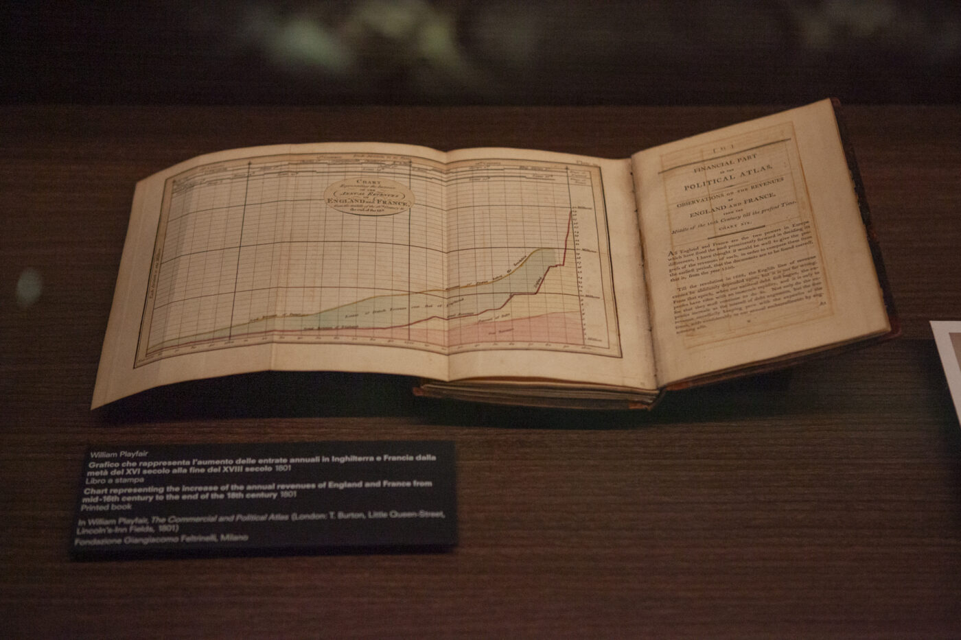
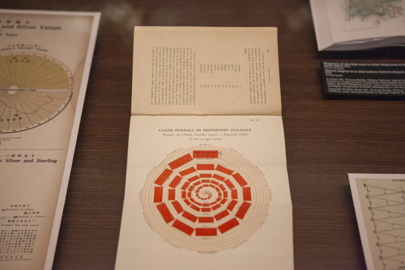
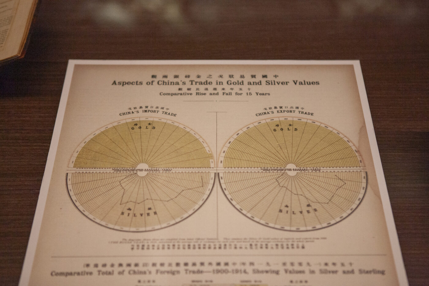
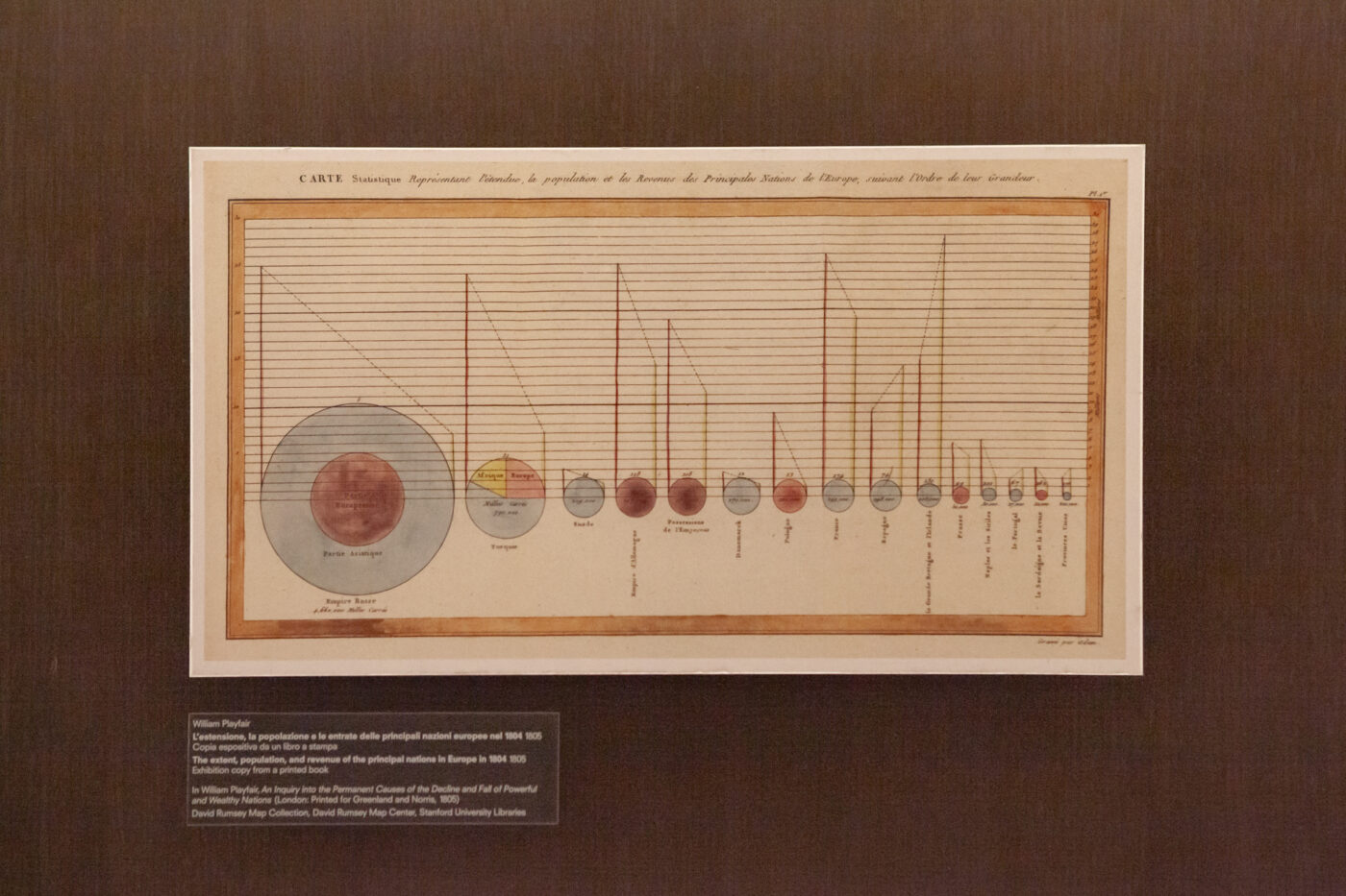
9. Value: charting wealth
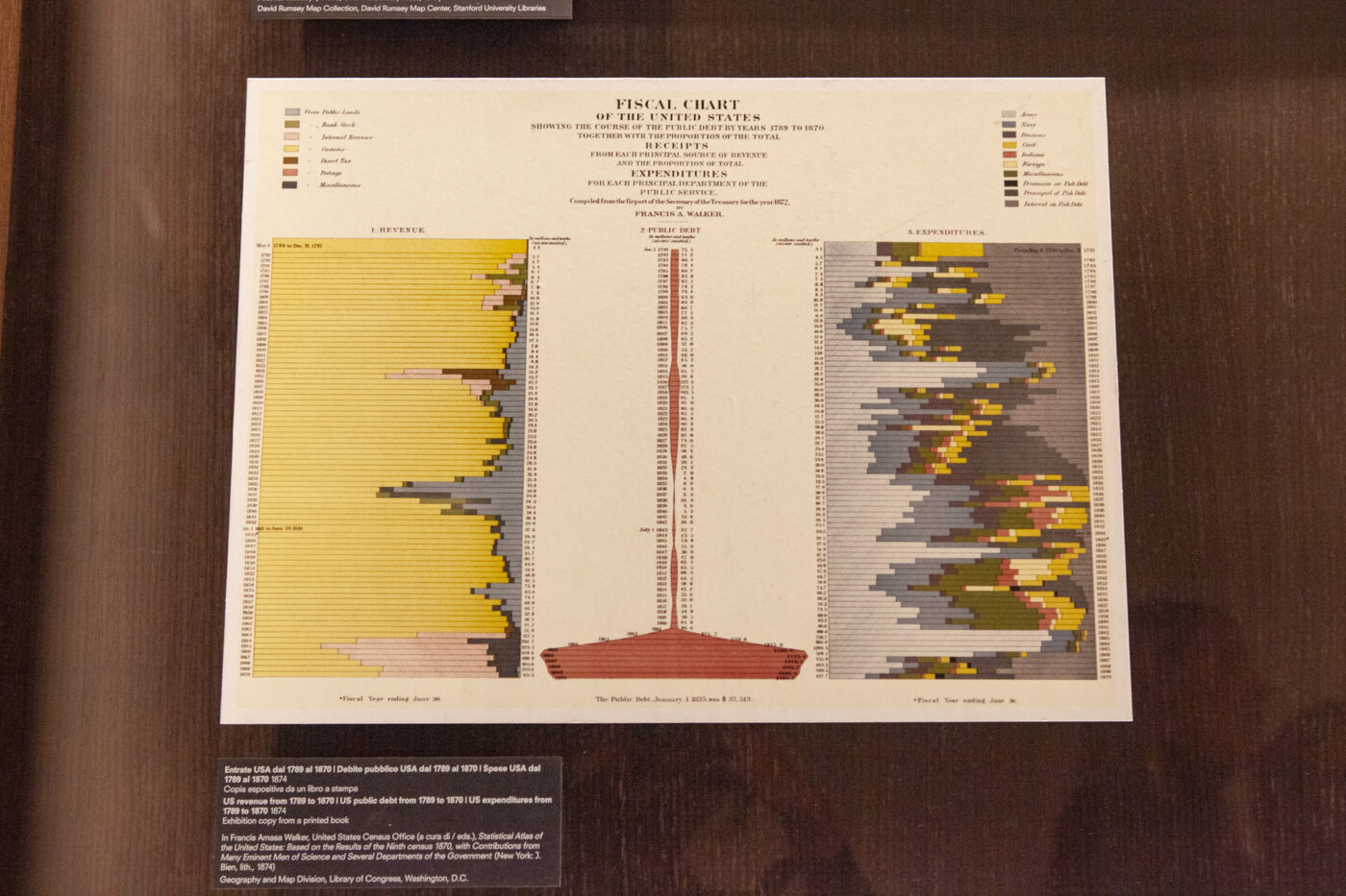
For over two centuries, diagrams have captured the mechanisms of economic value. From early trade maps to today’s cryptocurrency volatility charts, they visualize markets, forecast trends, and expose the flows of global capital. They illustrate not only how value is measured, but how it is imagined, constructed, and questioned.
Ultimately, the exhibition reveals that diagrams are not neutral. They influence policies, shape perceptions, and anchor collective memory. Their power lies in their ability to clarify — and their danger in their ability to distort. Understanding them means understanding the world they help us see.
Other articles
Articles
February 26, 2026
Veo 3 and generative AI: scaling video production through automation
Articles
February 27, 2025
Pirelli Foundation: a journey through design, innovation, and history
Articles
December 18, 2025
Reframing Data Visualization: Power, Aesthetics, Multimodality, and the Urgency of Change
Articles
November 27, 2025
Rethinking visualization: reflections from IEEE VIS 2025
Articles
November 27, 2025
Topography of a Talk: between Vibe-Coding and Parametric Design
Articles
October 29, 2025
Navigating the algorithmic frontier: a deep dive into GenAI and data visualization
No posts found
Subscribe to Berry, our newsletter!
Stories, insights and tips about the world of The Visual Agency and data visualization. Once a month, straight to your mail box. We will not send you boring stuff, it’s a promise.