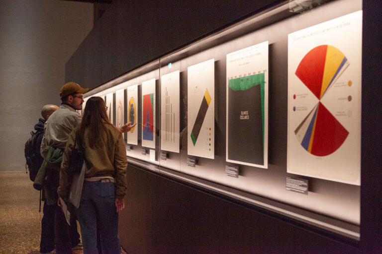
Attending the 2025 Information+ conference confirmed that the field of data visualization is at a critical inflection point, moving beyond technical execution to confront deep-seated questions of ethics, aesthetics, and representation. The most urgent conversations are converging around three core themes: the inescapable dimension of power, the discomforts of aesthetics, and the push toward multimodal and material forms.
Data, design and power
The concept of ‘power’ is once again central to the discourse, initiated by Bronwen Robertson’s talk, “Locating Ourselves in Data”, representing Data4Change approach on data-driven project addressing social, political and environmental issues. A crucial distinction is being drawn: “agency” in visualization does not equate to authorship, and neither fully translates to actual power. As Lauren Klein and Tanvi Sharma sharpened the point:
“How do we use our knowledge of the power of data visualization to make more ethical and intentional design decisions?”
This theme cascaded, particularly through the “Politics & Democracy” sessions:
- Patty Heyda’s “Radical Atlas” reminded attendees that planning tools do not merely represent the city but actively shape it, often reinforcing systemic inequality.
- Paul Kahn explored the atlas as a curated worldview.
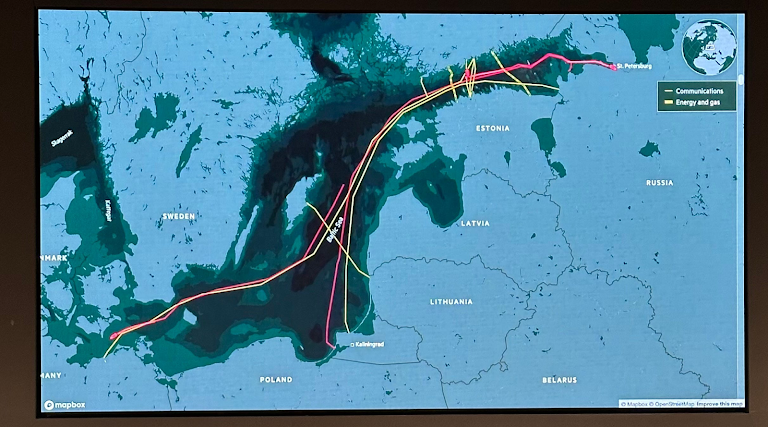
- Irene de la Torre Arenas from Financial Times showed how geopolitical storytelling in journalism can balance objectivity with empathy and accuracy with beauty.
- Gökcen Erkilic reframed coastlines as colonial artifacts.
- Chaewon Ahn mapped data resistance and counter-data practices.