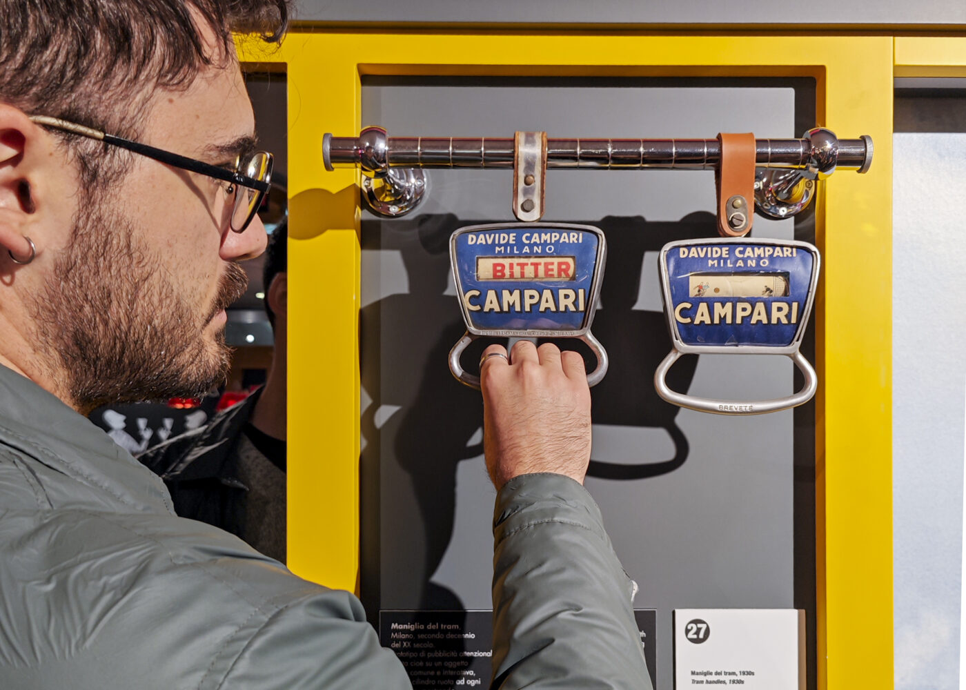
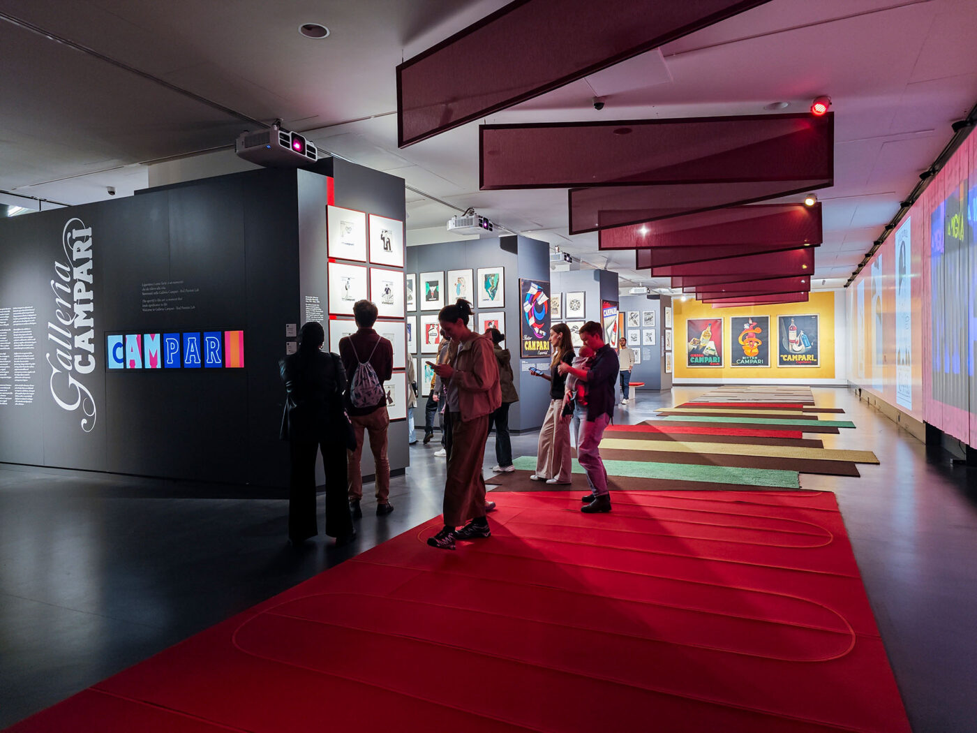
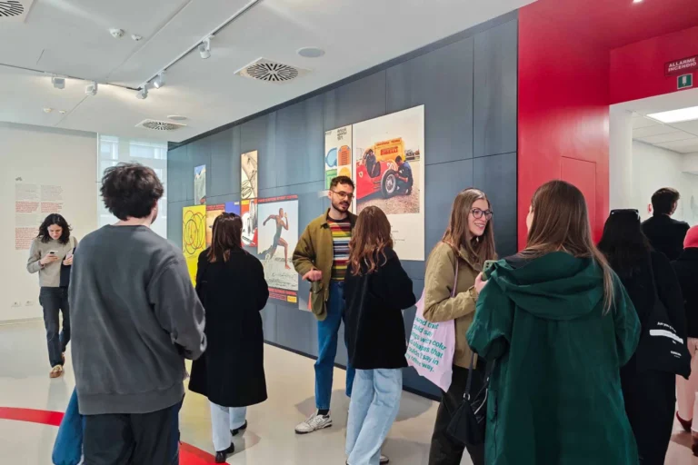
Recently, our team at The Visual Agency had the chance to visit Galleria Campari, the brand’s striking exhibition space in Sesto San Giovanni, just outside Milan. The visit offered us an immersive dive into the rich visual and cultural history of one of Italy’s most iconic brands. As we moved through the galleries – lined with bold posters, vintage advertising, distinctive packaging, and even original design sketches – we discovered how deeply rooted design, typography, and art direction are in Campari’s DNA.
Campari’s story began in 1860, when Gaspare Campari created the distinctive red aperitif in Novara. Over time, it evolved from a local bitter into a global symbol of Italian style, thanks to its bold and consistent focus on visual identity. In the early 20th century, under Gaspare’s son Davide, the brand began collaborating with artists to craft a unique and modern image.
A pivotal moment came in the 1920s with Futurist artist Fortunato Depero, whose geometric posters and experimental typography gave Campari a radical new voice. He also designed the iconic Camparisoda bottle in 1932 – label-free, conical, and instantly recognizable – a milestone in industrial design.
Typography became central to Campari’s visual identity, with bold, angular fonts and dynamic layouts reflecting the brand’s energy and sophistication. As we explored the exhibition, it was striking how much care went into every detail, from letterforms to composition.
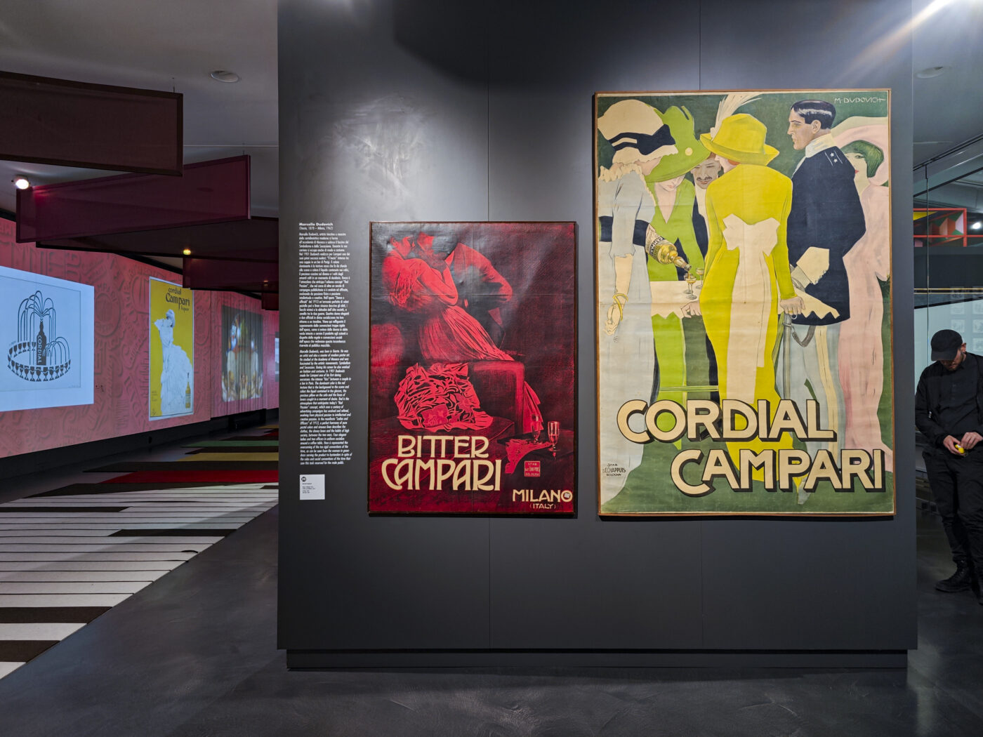
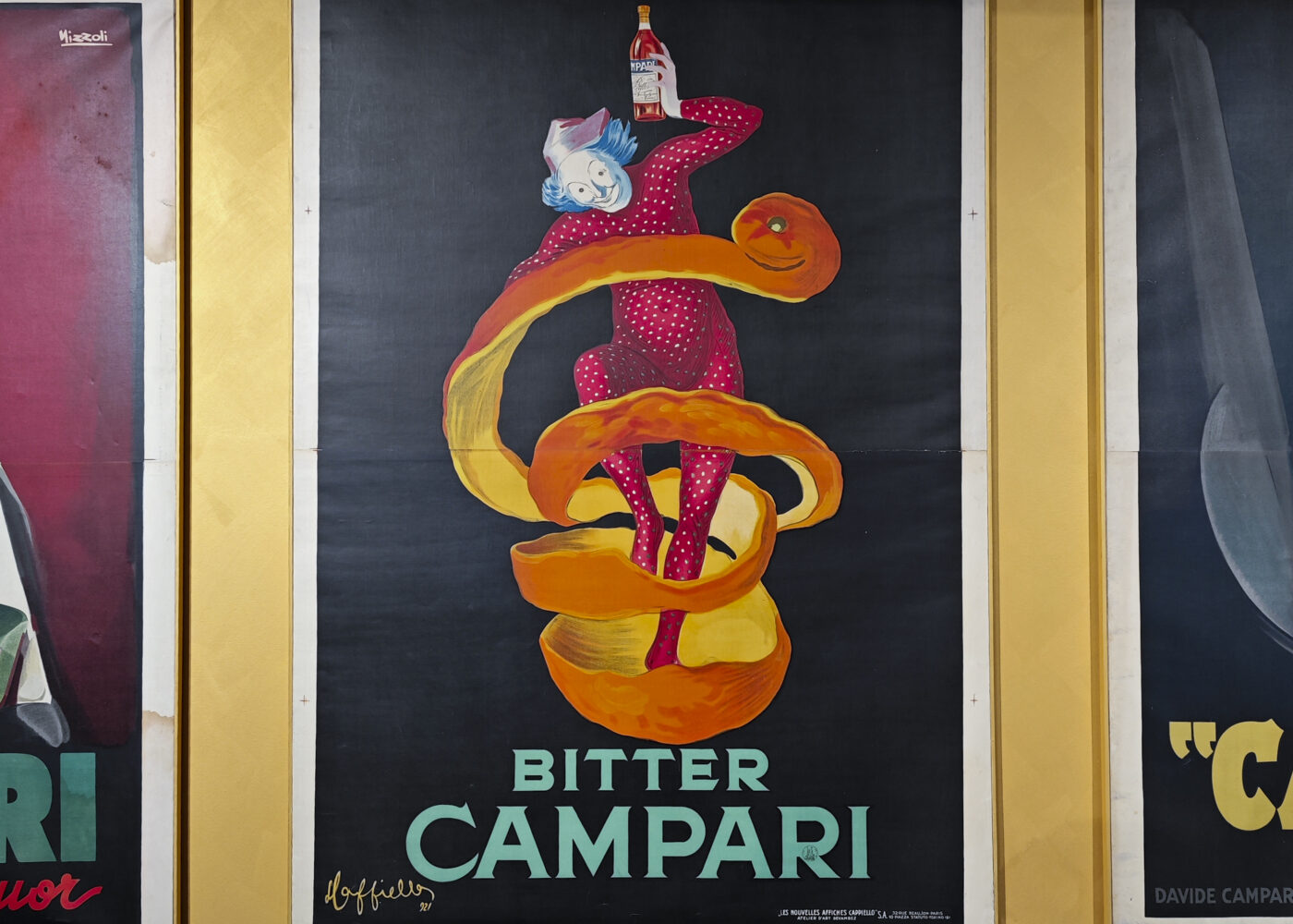
Throughout the 20th century, Campari continued working with legendary illustrators like Leonetto Cappiello and Marcello Dudovich, producing campaigns that blurred the line between advertisement and art, each one a piece of cultural history.
The visit to Galleria Campari gave us a renewed appreciation for how the brand has continually redefined itself visually while remaining unmistakably Campari. It’s a living example of how design, when treated as a core value rather than a final layer, can build a brand that is both timeless and contemporary.
Today, Campari isn’t just a drink, it’s a case study in the power of design to shape perception, create desire, and stand the test of time.
Other articles
Articles
February 27, 2025
Pirelli Foundation: a journey through design, innovation, and history
Articles
December 18, 2025
Reframing Data Visualization: Power, Aesthetics, Multimodality, and the Urgency of Change
Articles
December 15, 2025
The World Mapped: how 9 Diagrams shaped our understanding of reality
Articles
November 27, 2025
Rethinking visualization: reflections from IEEE VIS 2025
Articles
November 27, 2025
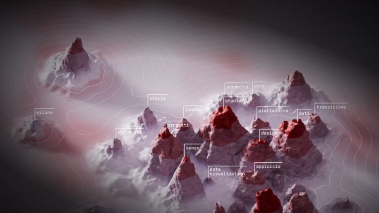
Topography of a Talk: between Vibe-Coding and Parametric Design
Articles
October 29, 2025
Navigating the algorithmic frontier: a deep dive into GenAI and data visualization
No posts found
Subscribe to Berry, our newsletter!
Stories, insights and tips about the world of The Visual Agency and data visualization. Once a month, straight to your mail box. We will not send you boring stuff, it’s a promise.