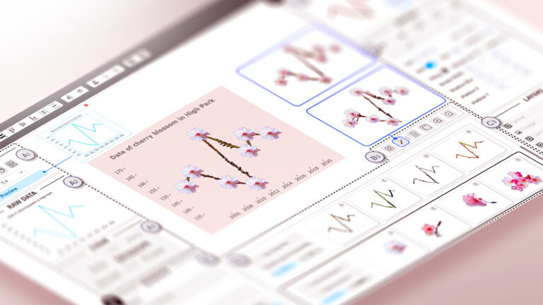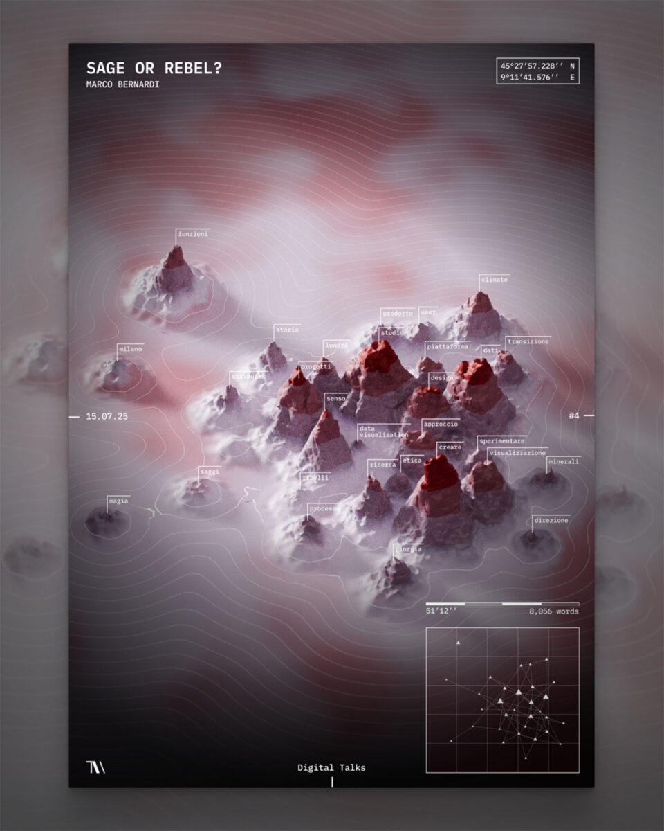
Data visualisation is often associated with the graphical representation of numbers. In this case, however, the data is in the form of words that take the shape of a landscape, reflecting the listener’s impressions through colour gradients.
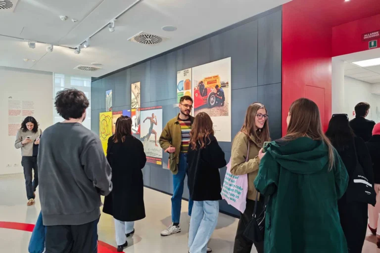
To illustrate the process behind this experiment, we will discuss the composition we created for Marco Bernardi, a data visualization expert. His talk focused on the distinction between the “sage” and the “rebel”—two archetypes of visual and design thinking.
In this process, the word is transformed into data at two levels. Firstly, it serves as information relating to the semantic content of the speech. Secondly, it acts as an element capable of eliciting a reaction in the listener. These two levels of analysis run in parallel and their superposition defines the final composition of the project.
The first analysis is quantitative, treating each word as a data point whose repetition and association with other terms define the network of recurring themes in the talk. To achieve this, a textual analysis tool based on the Claude algorithmic model was developed.


The tool uses the transcription of Marco’s talk, obtained via Microsoft Teams, as its source data. Filler words, auxiliary verbs, and generic conjunctions used in spoken language were removed from the analysis. The resulting network, composed of nodes and connections, effectively shows the density and logical links between the concepts discussed.
Once the network had been obtained, we imagined what it would look like if we were to read it as a landscape. In this metaphor, each node (word) corresponds to a mountain whose height and dimensions are proportional to the frequency of that term in the discourse.
Nodes in close proximity form actual mountain ranges, representing closely related themes. Conversely, distant nodes manifest as isolated mountains, highlighting arguments that are more detached from the main topics.
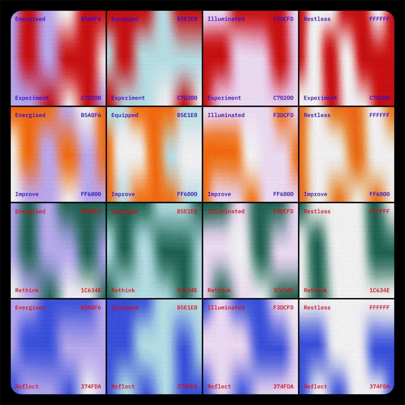
The second analysis, qualitative in nature, focuses on the impact of the words on the listeners. At the end of the talk, the audience is invited to answer two questions: “What was the most immediate effect this talk had on you?” and “What is the next step you feel you want to take?”. Both questions offer four possible answers, and for each question, we define a palette, encoding a color for every response. The color combination that forms the background of the landscape is the final result of the survey, derived from the two answers that garner the majority of votes (one per question), for a total of 16 possible combinations.
The palette generation phase was guided by the principle of contrast useful for visual accessibility. It was essential to ensure that the two associated tones were clearly distinctive. The colors associated with the first question develop predominantly on light and bright tones, while, by contrast, the colors associated with the second question feature lower brightness levels and more intense saturation levels.
In the final composition, the two analyses are superimposed: the network, representing “what was said,” is manifested as mountains in the background. The “how it was perceived” defines the chromatic tone of the landscape, through the color combination resulting from the survey.

The generative and parametric nature of the process allows for constantly unique compositions. The contextual information—speaker’s name, date, event title, and location—completes the design.
The result is a unique and unrepeatable combination, because it is born from the real data of a specific shared moment. Every visual choice, including the height of the individual mountain and the color gradients, is rooted in real information permeating the trace of a voice and the audience’s reaction.