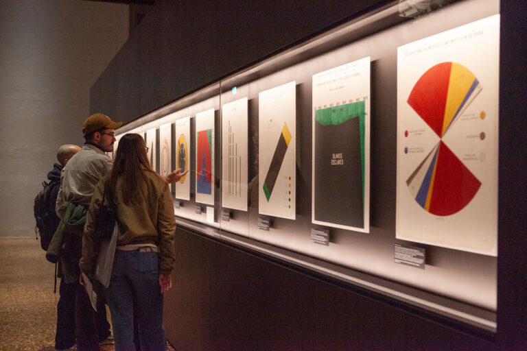
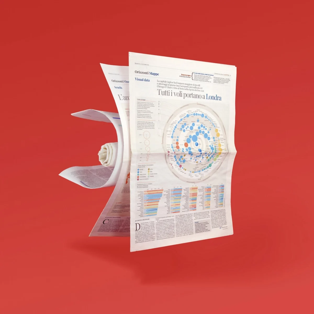
The first online "Visual Data" on Corriere della Sera is signed by us

For the Milanese publication, one of the most authoritative at the Italian level, we traced and visualized what Italians had been searching for on Google during 2017, and then compared it with the research carried out in other countries – like the United Kingdom, France, Germany and the US.

Year:

February 21, 2018

Type:

Articles

To do this, we used Google Trends, a tool that lets you know how often you search the web for a given word or phrase – search and display can be set by country and language.

In particular, we selected the queries that, for each month of 2017, had had a greater search variation. The results were then compared over the whole year, to normalize them on a scale from 0 to 100. Finally, for each query all the values ​​of interest were collected over time in 2017 to visualize the trend and obtain the average value of research on the year.

The project rewards the collaboration that we hold with Corriere della Sera on the supply side of infographics, which began in 2013 with the paper and consolidated format.
Other articles

tva-pirelli-1
IMG_20250522_124409
tva-venice-2025
1
Blog cover
TVA-infopoetry
berry

Subscribe to Berry, our newsletter!​

Stories, insights and tips about the world of The Visual Agency and data visualization. Once a month, straight to your mail box. We will not send you boring stuff, it’s a promise.