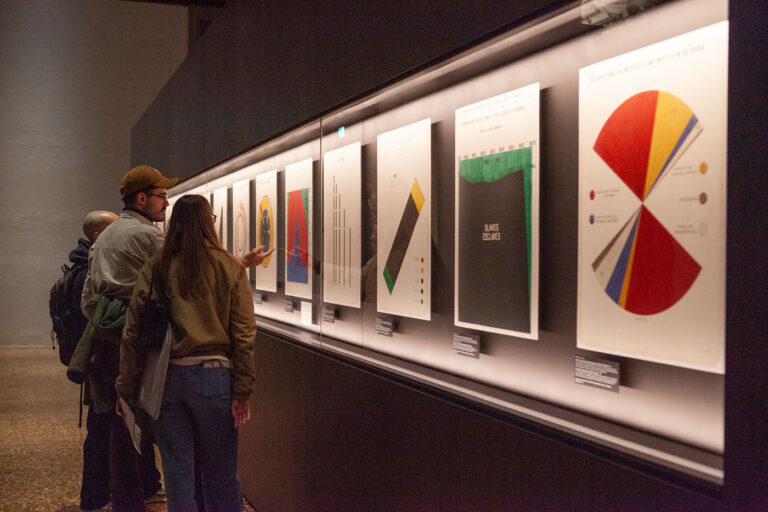
Every organization now produces data visualizations. Dashboards, reports, social media posts, investor decks: data has become the default language of business communication. And with generative AI entering the workflow, the assumption is spreading that visualization is becoming a commodity: describe what you need, get a chart, move on, repeat.
CHI 2026, the world’s largest conference on human-computer interaction (held this April in Barcelona, with nearly 1,700 papers presented) tells a different story. The research emerging from this community doesn’t just matter to academics. It directly concerns anyone using data to inform decisions, communicate with stakeholders, or reach a public audience, and anyone designing those communications professionally.
AI knows the rules (that’s both the good news and the problem)
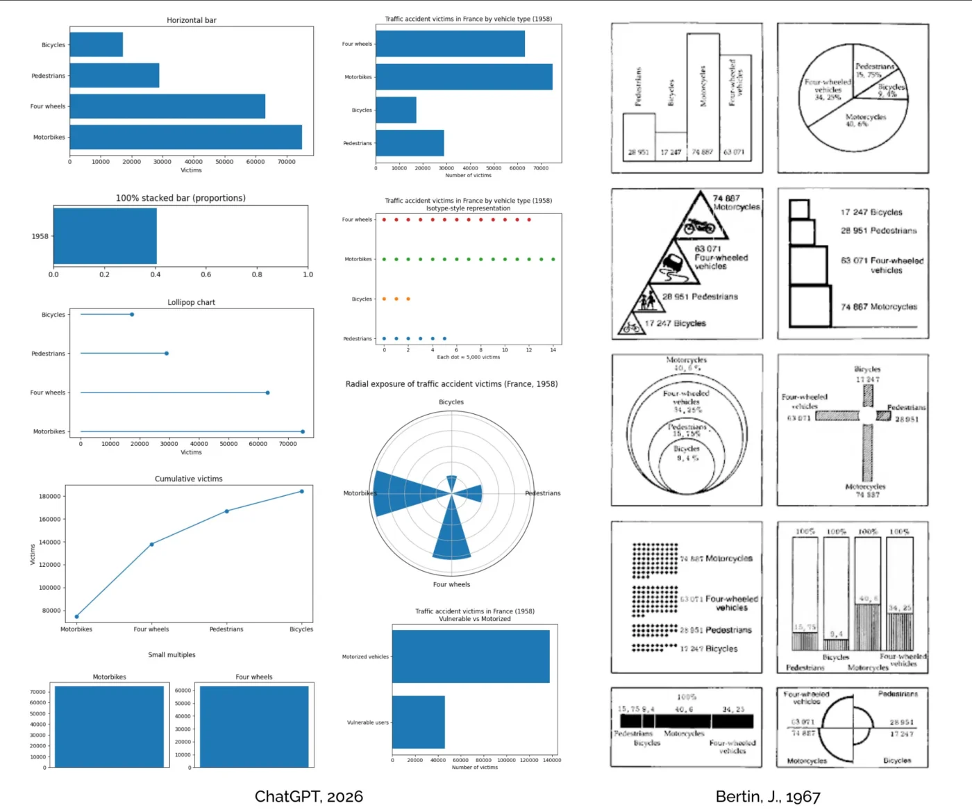
Let’s get the AI question out of the way first. A study by Kim, Ahn, Myers and Bach, first published in ACM Transactions on Computer-Human Interaction and presented at CHI 2026, tested how well ChatGPT performs as a visualization design advisor, comparing its responses to those of human experts. The finding: ChatGPT excels at breadth and clarity. It generates a wider range of suggestions, faster, and in a well-structured format. If you need a quick answer to “what chart type should I use for this data?”, it’s reliable.
But practitioners in the same study preferred the human experts. It doesn’t mean the AI was wrong, it just couldn’t do what a good consultant does: read the situation, push back on the question itself, or recognize that the real problem isn’t the chart, it’s the message. AI models know the catalogue, know the conventions, the standard chart types, the rules that 53 organizations codified in their style guides (more on that below, and here). What it doesn’t know is when to break them.
This has a practical implication for any team integrating AI into their data communication workflow. AI is an excellent quality-control layer, catching inconsistencies, suggesting alternatives, enforcing a style guide. It’s a poor substitute for the judgment calls that determine whether a visualization actually works: what to leave out, what to emphasize, how to frame a message for a specific audience in a specific context. The organizations that treat AI as an accelerator for their existing design capability will produce better work. The ones that treat it as a replacement for design thinking will produce more charts, faster, that say less.
For practitioners: this is also a positioning question. If AI handles the standard catalogue fluently, the value of a visualization professional shifts toward what the model can’t do: contextual judgment, message strategy, the ability to push a client’s brief beyond the obvious solution. The teams that compete on execution speed will lose to the machine. The ones that compete on interpretation will not.