Reorganizing the information assets of a banking group
Description
Background
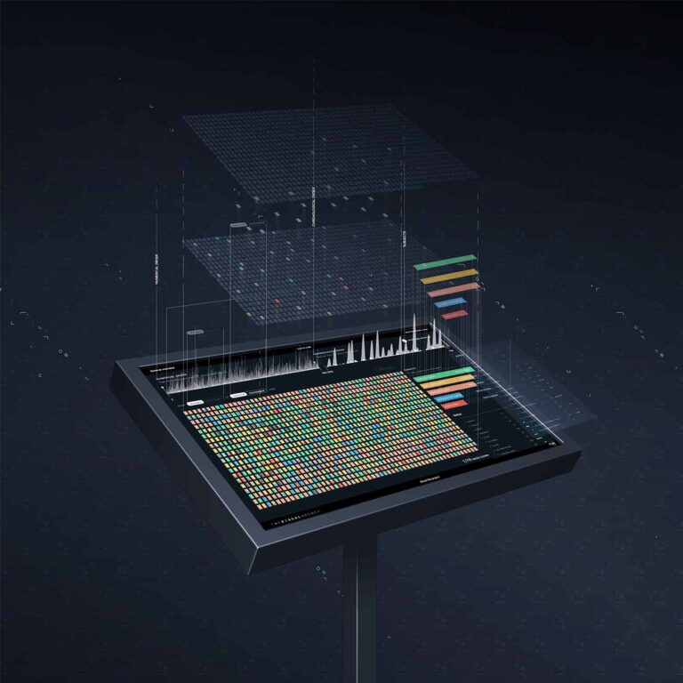
Credem – a prominent Italian banking group – needed a tool that would allow them to organize and effectively use the company’s immense wealth of information in a simple and intuitive way. To achieve this goal, The Visual Agency worked closely with the client to create an interactive dashboard tailored to the end user, so that employees can access any data or information through a few simple clicks.
Objective
Design an interactive dashboard that makes the client’s information assets easily accessible and explorable.
Result
The ability to communicate detailed information through a user-friendly, interactive dashboard facilitated the decision-making process.
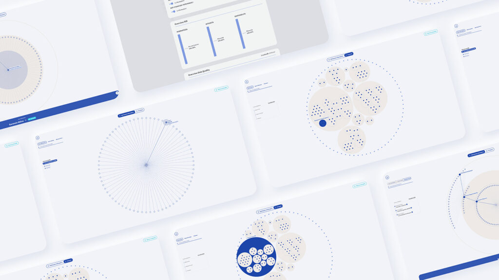
The dashboard that makes complex information assets accessible.
Year:
2021
Industry:
Finance
A user-centered approach
The design of this interactive dashboard, developed in close collaboration with the client, is purely based on the user’s needs. For this reason, several user experience tools (personas, user flow, information architecture, etc.) were used to analyze and test usability. In this way, it was possible to develop a dashboard with a user-centered design that makes the analysis and use of data extremely accessible for the end user, thanks to a visualization that adapts to specific navigation flows.
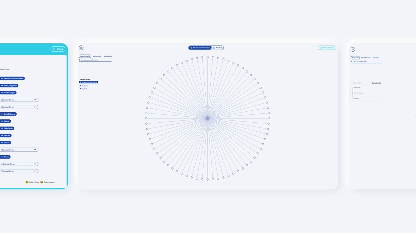
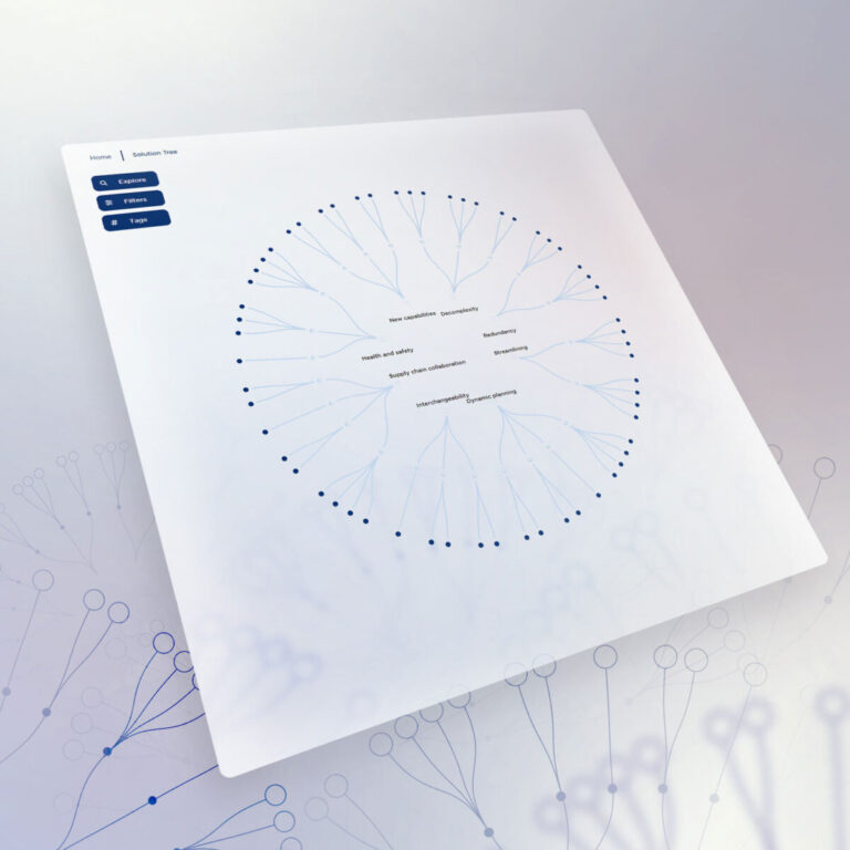
The visualization
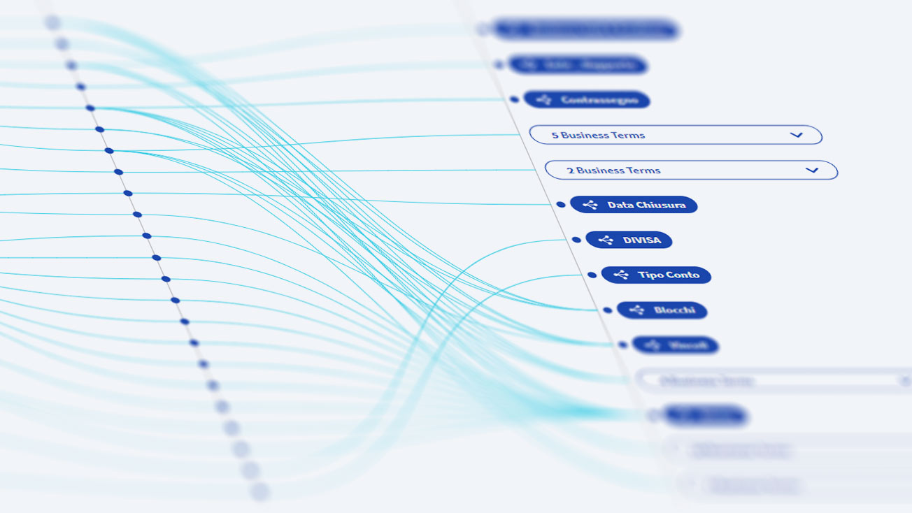
Hierarchical data is grouped into three levels that can be gradually accessed: by selecting the first one, you can see the second one, and so on.
Each piece of data is associated with its metadata, which can be found in the information area at the bottom of the page.
The search engine
The side search engine allows the user to search for data by keywords, bypassing the hierarchical level. In this way it is possible to carry out a more precise search. The dashboard is therefore extremely functional, thanks to the various tools that make the research much quicker.
Different needs, different visualizations
The dashboard offers two different views allowing two different types of research:
Patrimonio Informativo: the main view described above.
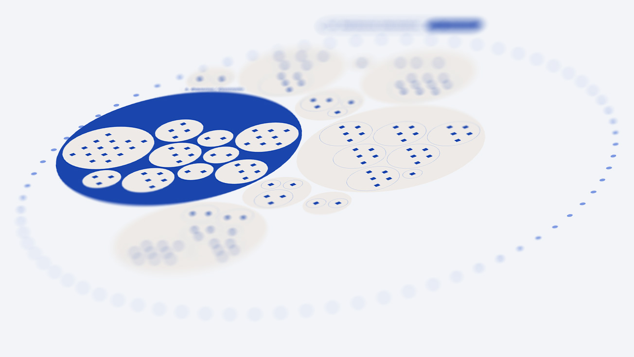
Processi: this interactive visualization resulted from a direct customer need. It shows data about the processes, hierarchically organized into clusters called “circular packings”.
Advanced research
This function is intended for even more in-depth analysis. It allows users to explore the data of the information assets through further research fields: data owner, destinations of use and applications.
Our Projects
-
Dashboards and data visualization
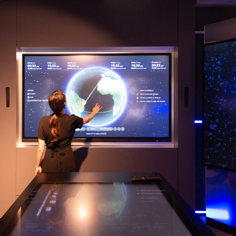
An interactive atlas for operational mapping
Biblioteca Ambrosiana
Dashboards and data visualization
Decoding Leonardo Da Vinci for the world
TVA
Dashboards and data visualization, Data-storytelling
A digital collection to experience Dante’s Divine Comedy
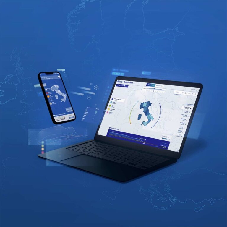
Terna
Dashboards and data visualization
A digital platform to guide energy transition
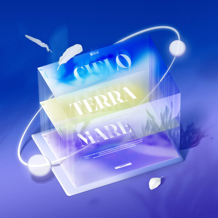
Terna
Dashboards and data visualization, Sustainability reporting
An immersive platform to communicate sustainability
Gs1
Dashboards and data visualization
Mapping companies’ logistics at the time of Covid-19
No posts found
We’d love to hear about your project! Drop us a line